For the sake of completeness:
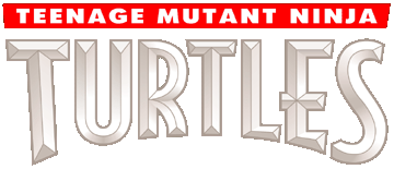
Volume 1 (City at war) / Volume 2
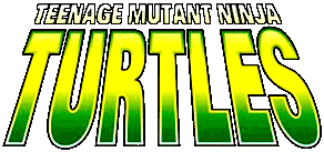
Volume 3
Volume 4 (1st version)
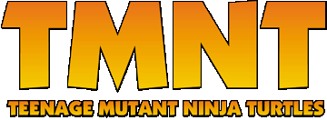
Volume 4 (2nd version)
While Volume 1 logo will always have a place in my heart, I think Volume 2 logo is one of the best and even if I don't like 1987 OT stuff so much these days I have to admit OT logo is probably the most iconic of the bunch with that "Turtles" font and that color scheme.
Volume 4 1st version is ok, it matches Michael Dooney colors and Mirage logo well on the covers. Volume 4 2nd version is... not so good.
Volume 2 logo has been used in some European reprints of the first Volume 1 issues