
|
 11-02-2017, 02:58 PM
|
#1 |
|
Megan Fox = April
 
Join Date: Feb 2005
Location: Tokio, Italy
Posts: 9,998
|
TMNT logo history
The official TMNT twitter tweeted this picture of the logo's TMNT has used in all their incarnations, I found it interesting since we're all familiar with the classic logo but looking back at the image it seems to have been retired. Also used for Archie and the video games at the time.
Also worth noting that the movies have a different logo, we so often seem them released with the OT's logo that I forgot they even had a different logo. Sadly the only logo missing from here is TMNT 2007, even The Next Mutation made it; RIP friend. 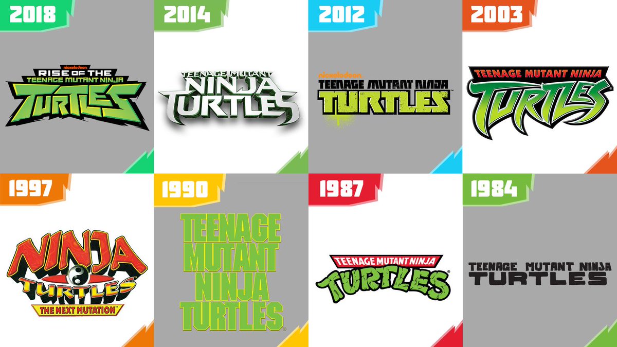
|

|

|
|
11-02-2017, 03:08 PM
|
#2 |
|
Overlord

Join Date: Dec 2004
Posts: 41,030
|
It's kind of funny how similar the 2k3 logo is to the original cartoon logo, especially since Peter Laird wanted to distance the show as much from the original cartoon as possible.
|

|
|
|
11-02-2017, 03:14 PM
|
#3 | ||
|
Emperor
Join Date: Jul 2014
Location: Stockholm
Posts: 9,442
|
Quote:
__________________
Quote:
|
||
|
|
|
|
11-02-2017, 04:36 PM
|
#4 | |
|
Megan Fox = April
Join Date: Feb 2005
Location: Tokio, Italy
Posts: 9,998
|
TMNT tweeted back at me, mentioned no disrespect to 2007 but thought it was a looked better representation, also mentioned he didn't put IDW for hte same reason.
Quote:
But I'm guessing they just wanted Rise to be at the top since it's the newest. |
|
|
|
|
|
11-02-2017, 04:38 PM
|
#5 | |
|
Emperor
Join Date: Feb 2009
Location: Portugal
Posts: 8,909
|
Quote:
|
|
|
|
|
|
11-02-2017, 05:58 PM
|
#6 | |
|
Foot Elite
Join Date: Feb 2010
Posts: 2,514
|
Quote:
|
|
|
|
|
|
11-02-2017, 07:51 PM
|
#7 | |
|
Team Blue Boy
Join Date: Jun 2014
Location: U.S., East Coast
Posts: 15,230
|
Quote:
|
|
|
|
|
|
11-02-2017, 10:25 PM
|
#8 |
|
Spooky ghost
Join Date: Aug 2013
Location: Western Australia
Posts: 2,266
|
That's a cool graphic. Man, that 2014 logo is a mess.
__________________
ProactiveMan! 
|
|
|
|
|
11-02-2017, 10:33 PM
|
#9 |
|
Yukipedia
Join Date: Nov 2016
Posts: 1,723
|
I still prefer the classic Mirage one out of all of them.
Also, is there a story or reason behind why the ‘j’ in ‘ninja’ is curved a bit? I’ve always wondered about that. |
|
|
|
|
11-02-2017, 10:35 PM
|
#10 |
|
Resident overthinker
Join Date: Nov 2015
Location: what is going on..........
Posts: 5,318
|
I've actually been wondering that myself recently...
__________________
|
|
|
|
|
11-03-2017, 12:05 AM
|
#11 |
|
無問題
Join Date: Jan 2004
Location: Moesko Island, WA
Posts: 14,313
|
I feel like if you had '07 and IDW in there it would look just as good.
__________________

|
|
|
|
|
11-03-2017, 11:16 AM
|
#12 | |
|
Emperor
Join Date: Feb 2009
Location: Portugal
Posts: 8,909
|
Quote:
|
|
|
|
|
|
11-03-2017, 11:36 AM
|
#13 | ||
|
Dub Professor
Join Date: May 2013
Location: Dub Side of the Moon
Posts: 3,442
|
Quote:
Quote:
|
||
|
|
|
|
11-03-2017, 03:26 PM
|
#14 |
|
Overlord
Join Date: Jan 2006
Location: Sweden
Posts: 10,155
|
Next Mutation should have more green colour in the logo.
|
|
|
|
|
11-03-2017, 04:32 PM
|
#15 |
|
Annalist
Join Date: Jul 2004
Posts: 16,435
|
We're missing TMNT 2007, the Image TMNT logo, and the two Volume 4 TMNT logos.
But for filthy casuals, this is fine. 
__________________
ALL THEIR DAYS ARE NUMBERED
|
|
|
|
|
11-03-2017, 08:49 PM
|
#16 |
|
Mad Scientist
Join Date: May 2010
Posts: 1,715
|
I like the next mutation logo best, because of the Zen Symbol.
__________________
My TMNT fanfic: https://www.fanfiction.net/s/1266176...n-a-Half-Shell IDW is the best version of TMNT If they make a TMNT reboot movie retelling the shredder battle/origin, I won't buy a ticket. |
|
|
|
|
11-09-2017, 08:34 AM
|
#17 | |
|
Foot Elite
Join Date: Feb 2010
Posts: 2,514
|
Quote:
|
|
|
|
|
|
11-15-2017, 06:37 AM
|
#18 |
|
Mad Scientist
Join Date: May 2010
Posts: 1,715
|
yeah, one of the few good aspects of how the series turned out.
__________________
My TMNT fanfic: https://www.fanfiction.net/s/1266176...n-a-Half-Shell IDW is the best version of TMNT If they make a TMNT reboot movie retelling the shredder battle/origin, I won't buy a ticket. |
|
|
|
|
11-15-2017, 02:02 PM
|
#19 |
|
Mad Scientist
Join Date: Nov 2009
Location: Southern Europe
Posts: 1,983
|
For the sake of completeness:
Volume 1 (City at war) / Volume 2  Volume 3  Volume 4 (1st version)  Volume 4 (2nd version)  While Volume 1 logo will always have a place in my heart, I think Volume 2 logo is one of the best and even if I don't like 1987 OT stuff so much these days I have to admit OT logo is probably the most iconic of the bunch with that "Turtles" font and that color scheme. Volume 4 1st version is ok, it matches Michael Dooney colors and Mirage logo well on the covers. Volume 4 2nd version is... not so good. Volume 2 logo has been used in some European reprints of the first Volume 1 issues Spoiler:
|
|
|
|
|
11-15-2017, 02:04 PM
|
#20 | |
|
Weed Whacker
Join Date: Apr 2007
Location: Auburn, WA
Posts: 29,245
|
Quote:
For the record and to the surprise of no one I'm sure, I'm not too keen on IDW co-opting the Mirage logo for the IDW series. I like them honoring the roots thing but... that's really misleading.
__________________
|
|
|
|
|
 |
|
|


 unaliving tonight


 Linear Mode

