
|
 04-11-2018, 04:05 AM
|
#61 |
|
Emperor
 Join Date: Mar 2007
Posts: 7,902
|
I think it’s refrehing that a big size character like Raph becomes a main focus/leader.
It’s pretty rare because normally big characters like Hulk, Chewbacca, Rubeus Hagrid and such are treated like side characters. Here comes Raph, up front and centre, enormous and all, leading the pack. |

|

|
|
04-11-2018, 12:50 PM
|
#62 |
|
*The King of Nothing*
Join Date: Oct 2013
Location: No comment -_- ...
Posts: 2,755
|
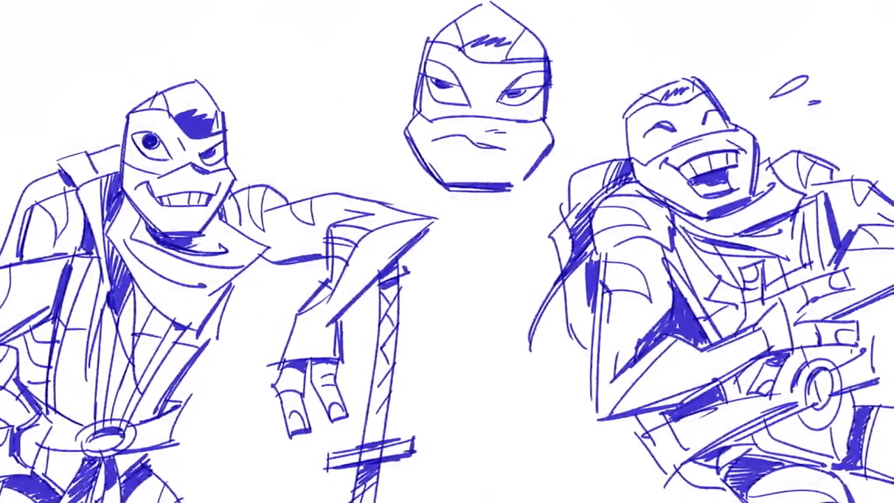
For some reason, Leonardo reminds me of Glenn Quagmire.
I ... don't think that's a good thing. |
|
|
|
|
04-11-2018, 04:26 PM
|
#63 |
|
So tired of this place
Join Date: Mar 2009
Location: Shell Ri La
Posts: 26,809
|
You are out of your mind,

__________________
 I'm convinced that none of you have ever experienced joy
|
|
|
|
|
04-11-2018, 04:52 PM
|
#64 | |
|
Emperor
Join Date: Mar 2007
Posts: 7,902
|
Quote:
Giggity. |
|
|
|
|
|
04-11-2018, 05:47 PM
|
#65 | ||
|
Big Blue Boy Scout

Join Date: Mar 2016
Location: New Bark Town
Posts: 4,484
|
Quote:
__________________
Quote:
|
||

|
|
|
04-11-2018, 06:12 PM
|
#66 | |
|
Team Blue Boy
Join Date: Jun 2014
Location: U.S., East Coast
Posts: 15,242
|
Quote:
 ** ** **I will forever use this one at every opportunity given... lol |
|
|
|
|
|
04-11-2018, 11:54 PM
|
#67 |
|
*The King of Nothing*
Join Date: Oct 2013
Location: No comment -_- ...
Posts: 2,755
|
Jeez. I didn't mean literally.
I just meant that his head shape reminded me of Quagmire's head. Last edited by Papenbrook; 04-12-2018 at 09:12 AM. |
|
|
|
|
04-17-2018, 12:49 PM
|
#68 |
|
*The King of Nothing*
Join Date: Oct 2013
Location: No comment -_- ...
Posts: 2,755
|
Donnie should of had the freckles.
Spoiler:
He would have looked even cuter! Also, they were gonna pull a Boom!Sonic with Leonardo. Spoiler:
Last edited by Papenbrook; 04-17-2018 at 01:05 PM. |
|
|
|
|
04-18-2018, 03:20 PM
|
#69 |
|
Mad Scientist
Join Date: Apr 2013
Location: Huntsville
Posts: 1,484
|
Still growing on liking the designs but I really don't like the over abundant crap on Don's back.
__________________

|
|
|
|
|
04-22-2018, 07:04 AM
|
#70 |
|
*The King of Nothing*
Join Date: Oct 2013
Location: No comment -_- ...
Posts: 2,755
|
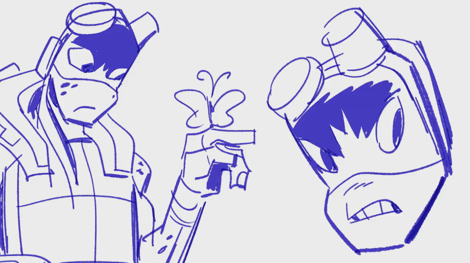
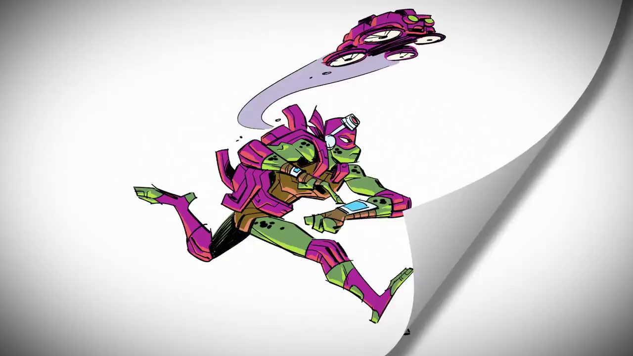
Speaking of which:
Spoiler:
It looks like, depending on the situation, Donnie will don different battle shells. |
|
|
|
|
04-23-2018, 07:29 PM
|
#71 |
|
*The King of Nothing*
Join Date: Oct 2013
Location: No comment -_- ...
Posts: 2,755
|
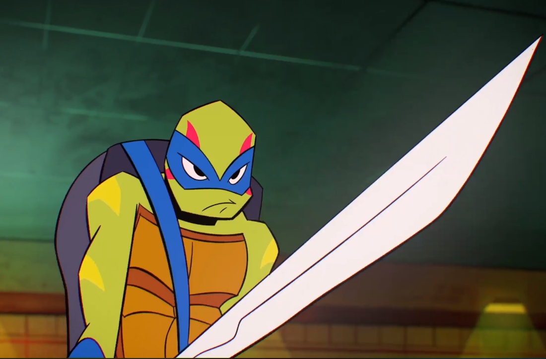
Ugh.
Spoiler:
Just ... UGH ...!!! Spoiler:
I swear, every time I look at Leonardo, he just seems more ... uncanny to look at. Why did Mr.Suriano make him like this? |
|
|
|
|
04-23-2018, 08:38 PM
|
#72 |
|
Team Blue Boy
Join Date: Jun 2014
Location: U.S., East Coast
Posts: 15,242
|
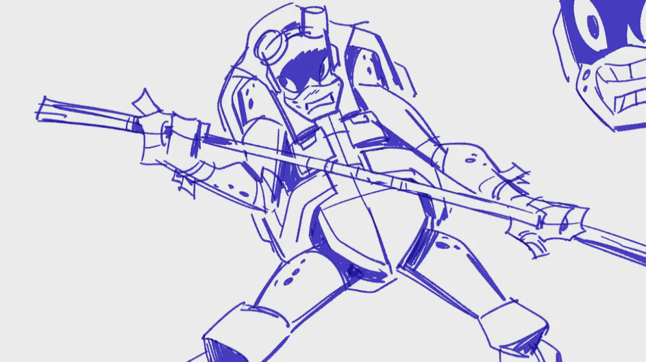
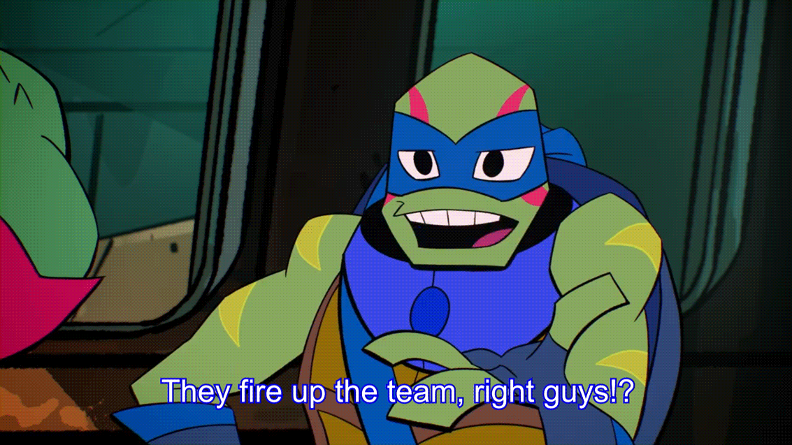
My only somewhat favorite shot of him so far would be this one...
 Less asshat-ish and something akin to a slight dash of 2003-ish-ness. |
|
|
|
|
04-23-2018, 08:53 PM
|
#73 |
|
Foot Elite
Join Date: Jan 2013
Posts: 4,177
|
Leo looks fine to me....In fact I feel he's one of the better looking designs between the turtles. Though all of them have something I like about them.
__________________
|
|
|
|
|
04-26-2018, 06:43 AM
|
#74 |
|
So tired of this place
Join Date: Mar 2009
Location: Shell Ri La
Posts: 26,809
|
Bums me out how much hate these designs are getting, I really like them.
__________________
I'm convinced that none of you have ever experienced joy
|
|
|
|
|
04-26-2018, 09:10 AM
|
#75 | |
|
Thug
Join Date: Dec 2016
Posts: 57
|
Quote:
__________________
 |
|
|
|
|
|
04-26-2018, 10:08 AM
|
#76 |
|
Overlord

Join Date: Dec 2004
Posts: 41,056
|
If the Turtles all looked like Leo I'd be fine, Leo has the best design I'd say. Mikey's is alright too. I just wish Raph was smaller and Don is ok.
The way they smile with their teeth hanging out is weird though. |
|
|
|
|
04-26-2018, 10:46 AM
|
#77 |
|
Team Blue Boy
Join Date: Jun 2014
Location: U.S., East Coast
Posts: 15,242
|
Forgive me, those movies kind of burned out most of my lifetime supply of sympathy for the "I'm sad people don't like a thing I like" angle. Who cares if not everyone agrees.
I don't entirely hate them, it could have been worse I suppose, but I've never much liked jarring, angular, pointy designs in most cases, and that includes when the 2003 series started doing it in the late seasons; albeit less extreme, but likewise still feels rather cheap compared to the early seasons. As far as any "hate" I have for this goes... Maybe 5% is to the designs really. 10% to the animation style and what they do with those designs that can help make it or break it. 85% is to screwing with their personalities and who'd they'd become over their 34 years of existence, which isn't helping me feel any love for the rest of it. (It bums me out that they felt the need to change Leo like that, like who he normally is just isn't interesting enough for inclusion -- I mean screw those who appreciate and/or relate to his kind of personality and who he is as a character. I suppose in some regard I'm insulted for both him and as a viewer.) |
|
|
|
|
04-26-2018, 11:28 AM
|
#78 | |
|
Thug
Join Date: Dec 2016
Posts: 57
|
Quote:
__________________
|
|
|
|
|
|
04-26-2018, 11:35 AM
|
#79 | ||||
|
PerfectlyTunedFightEngine
Join Date: Apr 2009
Location: The Upsidedown
Posts: 7,926
|
Quote:
You give a nuanced account of how the line art doesn't work for you and how the characterization isn't to your taste. That's way different than calling someone's intelligence into question, telling them they're not Real Fans, or otherwise putting on a show of gnashing and wailing. And while I can't speak for Powder, that's the kind of histrionic crap his sentiment seems to me to speak to.
__________________
------------------------------------------------------ Quote:
Quote:
Quote:
|
||||
|
|
|
|
04-26-2018, 01:34 PM
|
#80 | ||
|
Team Blue Boy
Join Date: Jun 2014
Location: U.S., East Coast
Posts: 15,242
|
Fair enough. More detail is always be helpful. (edit: I also English gud today.)
Quote:
 Quote:
Last edited by IndigoErth; 04-26-2018 at 05:08 PM. |
||
|
|
|
 |
|
|


 Linear Mode

