
|
|
|||||||
| View Poll Results: How Do You Prefer to Read Mirage? | |||
| Black and White |
   
|
23 | 82.14% |
| Colorized |
  
|
5 | 17.86% |
| Voters: 28. You may not vote on this poll | |||
 |
|
|
Thread Tools | Display Modes |
 06-07-2020, 08:19 AM |
#1 |
|
Stone Warrior
 
Join Date: Jun 2014
Location: United States
Posts: 947
|
How Do You Prefer To Read Mirage?
Do you prefer to read the original Mirage comics... in Black & White or Color?
Me personally, I think the colorized stuff is gorgeous but I prefer the Black and White look as it adds to the mood of the book. |

|

|
|
06-07-2020, 10:09 AM
|
#2 | |
|
Overlord

Join Date: Jul 2014
Location: Stockholm
Posts: 11,096
|
Well first off which colored version are you talking about? There are multiple.
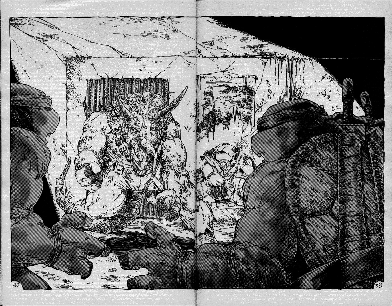
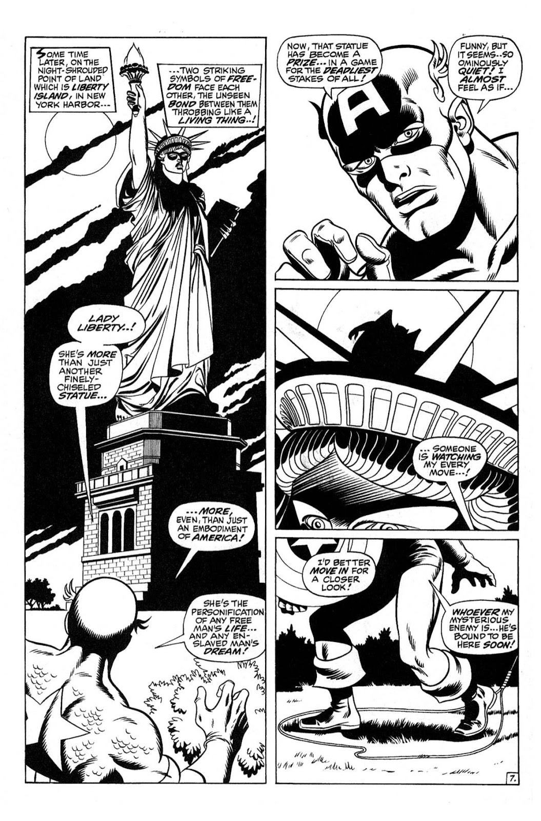
Ultimately though I have to go with Black and White. That's how most of those comics were printed and intended to be read. There's a clear difference between something like TMNT that was always meant to be without color and something like a Marvel essentials reprint which is just inks without the coloring. Note the greyscale. Spoiler:
Spoiler:
__________________
Quote:
|
|

|
|
|
06-07-2020, 08:47 PM
|
#3 | |
|
Stone Warrior
Join Date: Jun 2014
Location: United States
Posts: 947
|
Quote:
|
|
|
|
|
|
06-07-2020, 09:38 PM
|
#4 |
|
Banned
 
Join Date: Mar 2003
Location: nWo Country
Posts: 27,703
|
Mirage TMNT is a good enough example of a black and white comic book "done right", but I can't say it will ever be my preference. I can deal with it, but I'd generally prefer to look at things in color if it's an option.
They did a lot with the style choices they had to work with, but I'm not romantic about the whole "We gots no money" angle which precluded such decisions in the first place. They ultimately were not going for any sort of "style" so much as they were trying to save money on printing. They did well within the limitations, though. I just don't think it's mandatory or necessary for getting "the full experience". That said, I still end up reading my B&W single issues anyway, when I bother to go back to it, simply because I'm cheap and lazy and not inclined to buy a bunch of color reprints even though they exist and my eyes prefer it that way.  I honestly don't go back to them enough to make it worth the hassle of "upgrading", and my wife doesn't care about Mirage much anyway. So even if color is my "preference" I generally end up reading the books in B&W. Goofy, I know. |
|
|
|
|
06-08-2020, 06:32 AM
|
#5 | |
|
Stone Warrior
Join Date: Jun 2014
Location: United States
Posts: 947
|
Quote:
Mirage is great when it's great. But a lot of it sucks, especially the guest era. That said, THE RIVER 3 part story (Vol. 1 24-26) is my favorite guest story of all of them. |
|
|
|
|
|
06-08-2020, 09:54 AM
|
#6 |
|
Banned
Join Date: Aug 2005
Posts: 8,450
|
The River is a classic in my eyes. It's a very strange, almost dream-like story to me.
As for coloring, I loved the way Mirage Studios colored their stories, but I'll take black and white over the IDW coloring of Mirage. So it depends. |
|
|
|
|
06-08-2020, 11:13 AM
|
#7 |
|
Foot Soldier
Join Date: Mar 2019
Location: UK
Posts: 190
|
I prefer to read them as originally published, be it in B&W as per volume 1 or color as per volume 2.
Whilst the coloring of some of the B&W can be interesting, it often masks what I enjoy so much about the original series i.e the grit and the depth that the duo-board work manifested. I was glad that IDW republished the B&W originals in the Ultimate Collection, although I wish they had done a 'complete' collection which included all TMNT comic material from Mirage - from the short stories through the the 'guest' issues - regardless of story/art quality. But that's the completist in me. Some of the (re-)coloring has some strange choices, too - IDW's coloring of The Shredder was not clever and a bit shoddy, though they did some lovely work elsewhere. I have to say that, as a general rule, the re-coloring of books originally published in color leaves a lot to be desired: the way DC and Marvel approached their classic ranges tended to be really quite garish and unsympathetic and in those cases I might just prefer to see the black and white line art alone. |
|
|
|
|
06-08-2020, 12:24 PM
|
#8 | |
|
Stone Warrior
Join Date: Jun 2014
Location: United States
Posts: 947
|
Quote:
TMNT's Mirage duo-shade, duo-tone (whatever you wanna call it) is abandoned when coloring happens and as a result the grit and atmosphere kinda changes. That said, the colored Mirage stuff is pretty but its not the same. There are also a lot of comics fans who CANNOT abide B&W art. It's very often hard to make out for a lot of folks. Last edited by PizzaPower1985; 06-08-2020 at 12:36 PM. |
|
|
|
|
|
06-08-2020, 02:04 PM
|
#9 | |
|
Overlord
Join Date: Jul 2014
Location: Stockholm
Posts: 11,096
|
Also I just noticed a huge coloring mistake in the pic I posted. If you look closely at the black and white, you can clearly see that Zog's suit has large potions of his suit torn and even if it was intac it wouldn't cover his hands and feet. His hands, feet and left bicep should be exposed but they're colored in like the suit's intact.
God, I just intended to show off how greyscale and detail pop when a page uses B&W to it's advantage, I didn't realise the colored version is a total ****-up as well.
__________________
Quote:
|
|
|
|
|
|
06-09-2020, 05:40 PM
|
#10 | |
|
Foot Soldier
Join Date: Mar 2019
Location: UK
Posts: 190
|
Quote:
|
|
|
|
|
|
06-09-2020, 06:23 PM
|
#11 |
|
Foot Elite

Join Date: Feb 2005
Posts: 3,009
|
Black and white I guess and I love the early shading in the Mirage books but the main thing keeping my preference for that is that none of the colour reprints have quite gotten it right.
The colour job on the IDW reprints is slick but then they get a bizarre choice like Shredder being coloured black/purple including his bare arms or the colour coding of the Shredder monsters in RTNY which just ruins it. I wouldn't mind but this isn't something which was never portrayed in colour so they had to make it up and I appreciate the team may have wanted to take some creative liberties but those are weird choices. Strangely the Image books have the best colour job I've seen on TMNT books. Everything is slick and how it was intended to be. The early issues improve drastically with colour. |
|
|
|
|
06-09-2020, 08:11 PM
|
#12 |
|
Random Punk
Join Date: Feb 2013
Posts: 22
|
While I was first introduced to the Mirage comics through the series of First graphic novels, I prefer the B&W. I love what the Mirage crew was able to achieve with the duo-tone.
And just my two cents - IDW messed up the coloring so bad. Reading their color version absolutely destroys the reading experience. Whereas the First editions enhanced the art, IDW overpowered and destroyed it. Look at these examples. Issue 1: Spoiler:
Issue 10: Spoiler:
|
|
|
|
|
06-10-2020, 03:18 AM
|
#13 | |
|
Mad Scientist

Join Date: Jun 2017
Posts: 1,404
|
Quote:
Also what's with the shifted position of the dialogue on page 1's first coloured version? |
|
|
|
|
|
06-10-2020, 05:21 AM
|
#14 | |
|
Stone Warrior
Join Date: Jun 2014
Location: United States
Posts: 947
|
Quote:
|
|
|
|
|
|
06-11-2020, 04:13 PM
|
#15 |
|
The Weed of Crime

Join Date: May 2013
Location: The Shadow's Sanctum
Posts: 3,007
|
Black and white, purely because I've yet to see a good colourized edition. Everything is either washed out or too dark and murky
__________________
 Who knows what Evil lurks in the hearts of Men?
The Shadow knows... |
|
|
|
|
06-11-2020, 04:32 PM
|
#16 | |
|
Mad Scientist

Join Date: Dec 2013
Posts: 1,110
|
Quote:
|
|
|
|
|
|
06-12-2020, 11:45 AM
|
#17 |
|
Hench Mutant

Join Date: Oct 2018
Location: 2105
Posts: 329
|
i like to read the colour version because it looks nicer. i don't mind reading it in b&w, but to me it looks nicer in colour and also has a better visual for the series
|
|
|
|
|
09-17-2020, 11:34 PM
|
#18 |
|
Mouser
Join Date: Oct 2011
Posts: 7
|
I personally feel they should be read in the form the original artist(s) intended them to be published while drawing them, as that intention affects choices made in the crafting of all aspects of the art. Drawing to be printed in black and white is different than drawing to be printed in color. Choices of page layout, shading, depth of field, all of it changes. Colorizing a B&W comic often results in muddy colors as the colors have to fight against the grey tones used to add depth and weight to B&W art, while printing art meant to be colored in B&W often results in a flat, difficult to distinguish page.
This is very clearly seen in the early issues of volume 3; the series was originally going to be in color, but was changed to black and white after the first couple of issues were drawn, resulting in some flat and muddled art Fosco adjusted much better after he knew it was going to be black and white, but even then the art still has a flatish quality about it.it wasn't until the Urban Legends reprints that the series actually looked as intended. So, to that end, I prefer volumes 1 & 4 in B&W, and volumes 2 & 3 in color. |
|
|
|
|
09-18-2020, 12:38 AM
|
#19 |
|
Weed Whacker

Join Date: Apr 2007
Location: Auburn, WA
Posts: 34,630
|
B&W. There was such an art to the detail of the duotone.
Colorized ones? Nothing against them, but I've never really seen consistently good colorized versions. There's always a ton of big mistakes
__________________
|
|
|
|
|
09-18-2020, 08:56 AM
|
#20 |
|
Detoxed Member

Join Date: Feb 2005
Location: Tokio, Italy
Posts: 11,238
|
Either but with colored bandannas on the turtles
|
|
|
|
|
|
|






 Linear Mode


