
|
 01-26-2006, 02:37 AM |
#1 |
|
Like, stupid rich.
 
Join Date: Sep 2003
Location: The Rawkzone
Posts: 2,808
|
New TMNT Poster Manip
Hey everyone, its been a while!
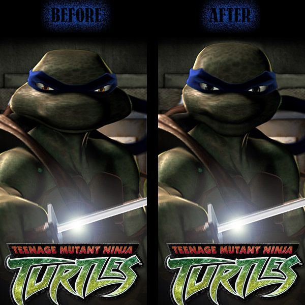
Anyways, I saw the new TMNT poster and had mixed feelings. Overall, much like the Superman costume, it grew on me. But I still messed around with it in Photoshop and I like mine a bit better. Im just curious to see what everyone else thinks. Basically I just brought the eyes closer together, turned them white, pushed his cheeks in, then pushed his cranium in as a whole. Overall, I like the finished product  What do you guys think? 
|

|

|
|
01-26-2006, 02:43 AM
|
#2 |
|
Devil's Advocate

Join Date: Feb 2005
Posts: 4,768
|
Imagi should definitely hire you to correct all the frames they plan to produce.

__________________
 Soooo... THIS is how you spend your free time now?! |
|
|
|
|
01-26-2006, 02:44 AM
|
#3 |
|
Foot Soldier

Join Date: Dec 2005
Posts: 232
|
Definately looks better to me
 Only one thing, the neck should be a little shorter in my opinion. Other than that, impressive work 
__________________
 |
|
|
|
|
01-26-2006, 03:32 AM
|
#4 |
|
Doodles TMNT for fun

Join Date: Jun 2005
Location: sploshin' through some sewer...
Posts: 2,137
|
The manip looks a tad funky on his shoulder... but it's really sad how much better the face is. Now to add a jaw...
Great work! |
|
|
|
|
01-26-2006, 06:35 AM
|
#5 |
|
I'm Baaaaaaccck!

Join Date: Sep 2003
Location: Pittsburgh, PA
Posts: 11,833
|
looks a hell of allot better!
|
|
|
|
|
01-26-2006, 09:20 AM
|
#6 |
|
Writer • Director

Join Date: Mar 2004
Location: Los Angeles
Posts: 12,035
|
This should be in the Fan Works section o_o
Nice work I actually thought it was real until I read your post. |
|
|
|
|
01-26-2006, 09:47 AM
|
#7 |
|
WingsOfDarkness! Perkele!

Join Date: Oct 2003
Location: In 7803...
Posts: 4,366
|
Looks alot better, just needs more chin.
__________________
|
|
|
|
|
01-26-2006, 04:50 PM
|
#8 |
|
Devil's Advocate
Join Date: Feb 2005
Posts: 4,768
|
Speaking of fan manipulations - here's one done by Ryona. I found that one on her board.
 Looks awesome in my opinion.
__________________
Soooo... THIS is how you spend your free time now?! |
|
|
|
|
01-26-2006, 05:17 PM
|
#9 |
|
Mad Scientist

Join Date: Apr 2004
Location: Conyers GA
Posts: 1,272
|
those are good
__________________
Im a silly and random person
|
|
|
|
|
01-26-2006, 05:19 PM
|
#10 |
|
Like, stupid rich.
Join Date: Sep 2003
Location: The Rawkzone
Posts: 2,808
|
I kinda like it/kinda dont. I like it cuz it reminds me of the young turtle episodes on the new show.... but kinda dont for a full movie based on after the first two...looks a bit too young.
But still a very cool manip. good job to that person! |
|
|
|
|
01-26-2006, 07:17 PM
|
#11 |
|
Doodles TMNT for fun
Join Date: Jun 2005
Location: sploshin' through some sewer...
Posts: 2,137
|
A little too human for me, and I like the forehead smaller... but it's still a quality manip. Virtually seamless.
|
|
|
|
|
01-26-2006, 07:43 PM
|
#12 |
|
Mad Scientist

Join Date: Sep 2003
Posts: 1,064
|
... *claps* very cool... very well done... I hope somebody from the movie's production staff sees this thread... cause this is what the turtles should really look like... very well done... both of them... ...
__________________
 |
|
|
|
|
01-26-2006, 10:25 PM
|
#13 |
|
Hench Mutant

Join Date: Dec 2003
Location: NEW YORK CITY
Posts: 429
|
OH MAN! BOTH OF THESE ARE BOTH WAY BETTER THEN THE ORIGINAL. I PREFER Juggalo'S. YOU DID AN AMAZING JOB, FOR REAL. IF THEY LOOKED LIKE THAT, I'D BE WAY MORE EXCITED.
__________________
 
|
|
|
|
|
01-26-2006, 10:37 PM
|
#14 |
|
Banned
 
Join Date: Aug 2005
Location: The Seventh Layer of Hell
Posts: 1,929
|
With all do respect dude, that looks pretty bad. Leo looks like one of the aliens from Signs.
I prefer the original. It reminded me of how they looked when they first appeared. |
|
|
|
|
01-26-2006, 10:55 PM
|
#15 |
|
Foot Soldier

Join Date: Jan 2006
Posts: 119
|
the first one reminds me of how they looked when they first appeared
__________________

|
|
|
|
|
01-26-2006, 11:22 PM
|
#16 |
|
Hench Mutant
Join Date: Jan 2005
Posts: 302
|
Ugh.. i'm sorry you guys, but those pictures.. I don't really like them.
As soon as I saw the picture in the first post, I immediately noticed the shape of the head and the eyes. They really bother me. I much perfered the Imagi's version over them. I can be okay with the head shape.. its much closer to the first movie... but the lack of pupils frighens me. They need pupils. No pupils works for the cartoon, but it is very distracting in CGI. Add the eyes, and the poster will probably work. I don't really like Ryona's pictures either. The eyes make a HUGE difference compared to the picture in the first post. But The head.. the mouth... It looks like a old man without his dentures. I will say this.. I think its extremely impressive what you guys've done with the poster... nice individual work, but I don't think its the right image for the TMNT. I'm sorry if I sound angry, but I had a strong reaction when i saw the pictures. I admire your skills with the computer, I do, but I much perfer the offical poster over them. Screw the negative comments that you guys made about the offical poster. They drew the turtles in an unique style, and I like the way they look. Last edited by IceFlash78; 01-26-2006 at 11:28 PM. |
|
|
|
|
01-26-2006, 11:49 PM
|
#17 |
|
Hench Mutant
Join Date: Dec 2003
Location: NEW YORK CITY
Posts: 429
|
I RESPECT YOUR OPINION, BUT I STRONGLY FEEL THAT WITH THE SHAPE OF THE ORIGINAL IMAGI LEO, THEY WOULD BE VERY LIMITED ON FACE EXPRESSIONS. THAT WOULD MEAN BAD CGI. IT DOESN'T MEAN THAT Juggalo OR Ryona'S LEO SHOULD BE WHAT THEY ULTIMATELY LOOK LIKE, BUT THE HEAD SHAPE MUST CHANGE TO GIVE US EXPRESSIONS. THE MOUTHS ARE WIDE ENOUGH TO FIT A MEDIUM SIZE PIZZA FROM DOMINO'S. HOW CAN THEY EXPRESS WORDS LIKE "OOOOO" OR "FORGET IT!!!!!!!!!!!!!!". I JUST CANT IMAGINE.
__________________
|
|
|
|
|
01-27-2006, 12:09 AM
|
#18 |
|
Banned
Join Date: Aug 2005
Location: The Seventh Layer of Hell
Posts: 1,929
|
I can picture how they're mouths would move. So it's not really that far fetched.
|
|
|
|
|
01-27-2006, 01:01 AM
|
#19 |
|
Doodles TMNT for fun
Join Date: Jun 2005
Location: sploshin' through some sewer...
Posts: 2,137
|
I want to clarify that I do respect the fact that they've come up with an original design. It might even look pretty good in still form. But it's gonna take some mad skills to make that look believable in motion. The mouth and, mostly. I can picture it in motion, but what I'm "seeing" is not good.
What we really need is some profile pictures of this design to see if this picture of Leo is hiding an actual chin. Because unless you want it to look like bad CG, it needs at least a small chin. |
|
|
|
|
01-27-2006, 02:00 AM
|
#20 | |
|
Like, stupid rich.
Join Date: Sep 2003
Location: The Rawkzone
Posts: 2,808
|
Quote:
I never really made any negative comments about the Imagi design. Like I said, i had mixed feelings, but it's grown on me. But I do have to side with the majority and agree that the face is just too wide. The initial feeling I got when I saw the poster was it looked too cartoony for my tastes. It reminded me of the CGI pilot turtles. The animation looked sweet but their faces just looked... deformed. Other than that, I think people are still intitled to their own opinions. If they dont like something, who else are they gonna express their thoughts to than us TMNT fans? Thanks for everyones feedback! I appreciate it! |
|
|
|
|
 |
|
|


 Linear Mode


