
|
 04-20-2010, 07:14 PM
|
#1 |
|
Weed Whacker
 
Join Date: Apr 2007
Location: Auburn, WA
Posts: 34,466
|
Kevin Eastman inking Frank Fosco
You can find a peek at this in the Image Conclusion thread, but as I think it just might warrant its own thread... here it is:
Before... (pencilled by Frank Fosco) 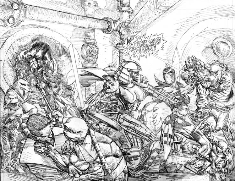 And now... after. (inked now by Kevin Eastman) 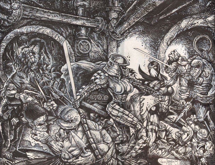 And after contrasting, readying-for-Photoshop: 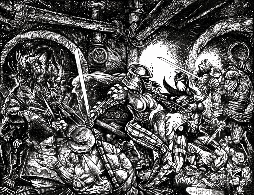 The final version, after colors from Sabacooza! 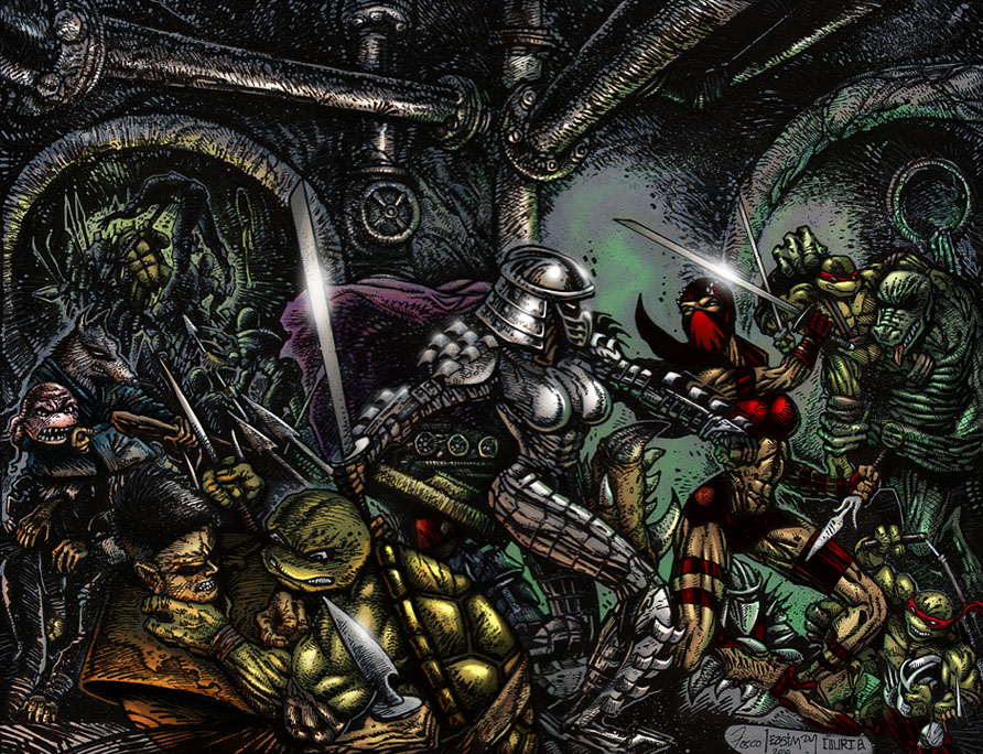
__________________
Last edited by Andrew NDB; 04-25-2010 at 01:28 PM. |

|

|
|
04-20-2010, 07:28 PM
|
#2 |
|
40 Years of TMNT

Join Date: Mar 2009
Location: Shell-Ri-La
Posts: 26,945
|
What I especially love is that it has so much of a super early vol.1 look to it. There were later issues of kevins that were more defined, cleaner, etc... but I like the grungey stuff much better.
|

|
|
|
04-20-2010, 07:32 PM
|
#3 | |
|
Overlord

Join Date: Feb 2004
Location: Between yesterday and tomorrow!
Posts: 15,482
|
Quote:
__________________
 Experience the TMNT Fan Commentaries! Check out my TMNT fan comic, "Nothing to Fear"! View my sketch work! I'm selling some of my hard-to-find TMNT items! |
|
|
|
|
|
04-20-2010, 07:33 PM
|
#4 |
|
I'm Baaaaaaccck!

Join Date: Sep 2003
Location: Pittsburgh, PA
Posts: 11,833
|
Pretty wild, reminds me of Kevin's art in "Zombie War".
|
|
|
|
|
04-20-2010, 08:08 PM
|
#5 |
|
Dare To Be Stupid!

Join Date: Dec 2008
Location: 1313 Mockingbird Lane
Posts: 4,752
|
Awesome. It has that gritty feel to it which I love.
|
|
|
|
|
04-20-2010, 09:27 PM
|
#6 |
|
Space Knight
 
Join Date: Jun 2007
Location: Colorado
Posts: 3,637
|
Man, so much love in that piece; almost makes ya wonder how differently the franchise would have been if Peter had left first.
|
|
|
|
|
04-20-2010, 09:33 PM
|
#7 | |
|
Overlord
Join Date: Feb 2004
Location: Between yesterday and tomorrow!
Posts: 15,482
|
Quote:
Spoiler:
__________________
Experience the TMNT Fan Commentaries! Check out my TMNT fan comic, "Nothing to Fear"! View my sketch work! I'm selling some of my hard-to-find TMNT items! Last edited by oldmanwinters; 04-20-2010 at 09:56 PM. |
|
|
|
|
|
04-20-2010, 09:50 PM
|
#8 | |
|
Foot Elite

Join Date: Nov 2007
Posts: 3,454
|
Quote:
Anyway, awesome piece. Only gripe is how dark the upper-left corner is. I know he wanted to lay on the grit, but it gets a bit muddled. This'll benefit from some color. |
|
|
|
|
|
04-20-2010, 10:03 PM
|
#9 | |
|
Space Knight
Join Date: Jun 2007
Location: Colorado
Posts: 3,637
|
Quote:
The point I was personally implying was how the comic may have reverted to its underground roots since he would have had free will to do his dark and gritty stories. I like Kevin's works, and while Heavy Metal readers give him flak for "ZOMG ruining the magazine", he still has that "underground" vibe to him that is so down to earth and awesome. Plus, even though he's but a tiny blip on the overall entertainment industry, some pretty big names seem to respect him/Heavy Metal so who knows, he could have made the badass Turtles movie we've all longed for come to fruition. It's all futile speculation, anyway. |
|
|
|
|
|
04-20-2010, 11:35 PM
|
#10 |
|
Mad Scientist

Join Date: Mar 2004
Location: Supermarket Aisle
Posts: 1,635
|
The first image is totally Frank Fosco, loving it.
The second inked image is totally retro Kevin Eastman. Love it too. Thanks for sharing this! |
|
|
|
|
04-20-2010, 11:54 PM
|
#11 |
|
I'm SUPER into myself
 
Join Date: Apr 2004
Location: California
Posts: 4,667
|
what does frank think about the inking drew?
|
|
|
|
|
04-21-2010, 12:05 AM
|
#12 |
|
Hench Mutant

Join Date: Nov 2008
Location: Finland
Posts: 400
|
I like Frank Foscos art and I like Kevin Eastmans art. But to be honest, I really don't like Eastman inks on this one, this style just doesn't mix too well with Foscos style. Fosco draws so thin lines, yet Eastman has always used a bit thicker lines and a bit different style.
Eastman also seemed to give Raph two eyes too intead of that eyepatch, but that can be corrected with coloring. |
|
|
|
|
04-21-2010, 12:51 AM
|
#13 | |
|
Weed Whacker
Join Date: Apr 2007
Location: Auburn, WA
Posts: 34,466
|
Quote:
You didn't notice Leo with both hands, and Donatello back to normal there, too? 
__________________
|
|
|
|
|
|
04-21-2010, 01:00 AM
|
#14 | |
|
Writer • Director

Join Date: Mar 2004
Location: Los Angeles
Posts: 12,035
|
Quote:
Still awesome though, glad to see the wheels moving. |
|
|
|
|
|
04-21-2010, 06:43 AM
|
#15 | |
|
Hench Mutant
Join Date: Nov 2008
Location: Finland
Posts: 400
|
Quote:
Oh well, just checked from comics, and it's his left eye that should be missing, while in this one I thought his right one was. Sorry, my bad. |
|
|
|
|
|
04-21-2010, 06:52 AM
|
#16 |
|
Stone Warrior

Join Date: Oct 2003
Posts: 673
|
I agree with what others have said. As good as it is to see Eastman involved, and to see that his style has remained, it kind of doesn't work here. It does give the art a gritty, volume one feel. But volume 3 isn't volume 1.
The final piece looks great, but Fosco's version is a lot better in my opinion. Just look at Cheng's face for an example. |
|
|
|
|
04-21-2010, 10:50 AM
|
#17 |
|
Overlord

Join Date: Dec 2004
Posts: 43,825
|
Its fine, but I do agree there's blogs of "dark" there.
I can't wait to see it colored though. I hope it brings a bit of the lost detail back. |
|
|
|
|
04-21-2010, 03:21 PM
|
#18 |
|
facehugger

Join Date: Jan 2006
Location: Aberdeen, Scotland
Posts: 2,817
|
Bloody awesome. Andrew NDB - you are awesome for making all this happen.
__________________
Oh Discordia! Charyou Tree! Come, Reap! Don't tell us to grow up and out of it I got my cloak and dagger in a bar room brawl You actually trying to read this tiny text? Damn, you're dedicated! This is all just for effect you know... original TMNT art collection |
|
|
|
|
04-22-2010, 02:02 AM
|
#19 |
|
Mad Scientist

Join Date: Nov 2009
Location: Spain
Posts: 1,535
|
I can see why many of you guys find it a bit too dark, but for me, this art is awesome. It doesn't look like the rest of Volume 3, that's for sure, but it doesn't need to. The fact that it's Eastman inking makes the change of style completely worth it. And also, it's only the cover, wich doesn't really affect the continuity in the art.
Some bits are a bit confusing, but when coloured it's gonna look perfectly clear. Last edited by Oculus Orbus; 04-22-2010 at 04:00 AM. |
|
|
|
|
04-22-2010, 03:28 AM
|
#20 |
|
Mad Scientist

Join Date: Feb 2009
Location: Ninja HQ, Moon
Posts: 1,076
|
The Eastman inking is old school rad, it really invokes memories of the original comics. That said, Fosco's lines in this are beyond awesome, I would love to see another version finely inked to do it justice.
|
|
|
|
 |
|
|


 Linear Mode

