
|
 10-31-2017, 02:57 PM
|
#1321 |
|
Overlord
 
Join Date: Dec 2004
Posts: 43,806
|
The logo looks "hip" which is expected of all kids show logo's these days, but that doesn't mean much.
I remember people thought the Nick Turtle designs looked "weird" at first too when they were revealed for the first time, then everyone liked them. I wonder if the Turtles will continue to look different now, instead of all being in same design bodies. Like Don was a little taller and had a gap in his tooth, Mike looked younger, Raph had the crack in his shell, etc. Hopefully they keep unique designs even if they change it up. |

|
|
10-31-2017, 03:15 PM
|
#1322 | ||
|
Overlord

Join Date: Jul 2014
Location: Stockholm
Posts: 11,041
|
Quote:
__________________
Quote:
|
||

|
|
10-31-2017, 03:16 PM
|
#1323 | |
|
Mutant Tiger

Join Date: Sep 2002
Location: Hialeah, Florida, USA
Posts: 14,161
|
Quote:
|
|
|
|
|
10-31-2017, 03:18 PM
|
#1324 |
|
Overlord
Join Date: Dec 2004
Posts: 43,806
|
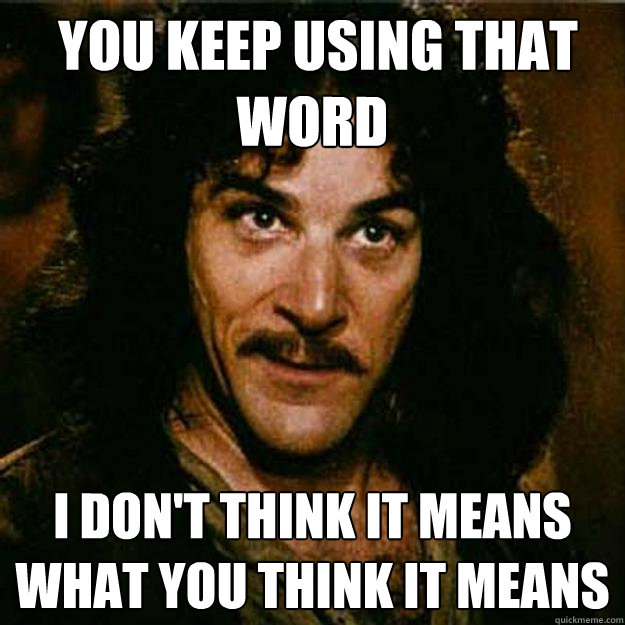
"Hip," "Lit," "Cool," or "Far Out" it all means the same thing.
|
|
|
|
10-31-2017, 10:28 PM
|
#1325 | |
|
Yukipedia

Join Date: Nov 2016
Posts: 1,723
|
Quote:
I still hate the designs they used and I’m sure I’m not the only one. I hope we don’t see those “unique traits” they gave them ever again. I can only imagine the process of coming up with those designs: “Hey, this is the smart nerdy guy! Let’s make him taller and skinnier! With a gap in his teeth! This is the funny and dumb one! Let’s give him freckles! Ooh, let’s make the angry guy short, with a battle-damaged™ shell! ‘Cause he’s the angry one!” Etc. So dumb. 
|
|
|
|
|
10-31-2017, 10:32 PM
|
#1326 |
|
Overlord
Join Date: Dec 2004
Posts: 43,806
|
It's a nice way to set them apart as opposed to them all being clones of each other like usual. I thought all the designs looked great and fun, I don't see a problem with it.
If anything I'm surprised this was never done earlier, seeing all the Turtles having the same body type as each other is bland. |
|
|
|
11-01-2017, 12:54 AM
|
#1327 |
|
Mad Scientist

Join Date: Jul 2017
Location: UK
Posts: 2,393
|
I also liked them being different in shape, size, colour etc, ads to their individuality. As for doing that again, they can make them individual without using the same traits/ look of the 2012's, they'd be a different design. (course for me the 2012's will always be my favourite but we all have different taste)
|
|
|
|
11-01-2017, 01:26 AM
|
#1328 |
|
Weed Whacker

Join Date: Apr 2007
Location: Auburn, WA
Posts: 34,418
|
In children's media, of course they can be noticeably different from one another to sell toys. It's been going on since the Smurfs, probably before.
In other media? No. Red-earred sliders look just about exactly the same. In film? You have different actors so they'll already be different. My "angry" red-earred slider doesn't look any different than the "thinker" one. But I am smart enough (i.e., have basic deductive reasoning skills that set in at about age 3) to tell the one with the sais apart from the one with the bo-staff.
__________________
|
|
|
|
11-01-2017, 01:47 AM
|
#1329 | |
|
Mad Scientist
Join Date: Jul 2017
Location: UK
Posts: 2,393
|
Quote:

Last edited by newfan; 11-01-2017 at 09:56 AM. |
|
|
|
|
11-01-2017, 03:46 AM
|
#1330 | |
|
Stone Warrior

Join Date: Mar 2014
Location: Palermo, Italy
Posts: 553
|
Quote:
I also love when TMNT have different body build and don't look all the same just with a different bandana |
|
|
|
|
11-01-2017, 10:45 AM
|
#1331 | |
|
Weed Whacker
Join Date: Apr 2007
Location: Auburn, WA
Posts: 34,418
|
Quote:
__________________
|
|
|
|
|
11-01-2017, 11:02 AM
|
#1332 | |
|
Mad Scientist
Join Date: Jul 2017
Location: UK
Posts: 2,393
|
Quote:
|
|
|
|
|
11-01-2017, 09:34 PM
|
#1333 |
|
Puppet Master

Join Date: Jul 2014
Location: UK
Posts: 2,825
|
Something about that logo rubs me the wrong way. Can't put my finger on it.

__________________
- - - 1990 > OotS > TMNT 2014 > Turtles Forever > TMNT III > SotO > TMNT 2007 "Can't we all just get along?" - pennydreadful "...bitchy people are what make fan forums insufferable when they don't need to be." - B-Man "Act like freakin' adults for goodness sake." - Jester "Tough guys with tiny voices." - Commenter 42
|
|
|
|
11-01-2017, 09:48 PM
|
#1334 |
|
Team Blue Boy

Join Date: Jun 2014
Location: U.S., East Coast
Posts: 16,293
|
A very sharp-edged pyramid that just kind of assaults your eyes with this big block of text?
In a way the razor edges are a little jarring shoved against the very soft Nick logo. And in terms of typography and how font styles and the collective image is used to express something about it... Given the limited info we know of, while the colors feel "younger and lighter" the sharpness typographically feels less "kid friendly" and not so much "mystic, ninja powers." Not to put it down, I'm sure someone probably fought with coming up with something that makes use of all that text, but... yeah, it's a little busy. Imo. edit: Also... the first three lines are pretty straight, and then you've got "Turtles" that stops following that rule and falls apart, when maybe the top edge along the T's E and S could have at least been flat across, instead of shifting and creating an uneven gap of space from under the last letter of "teenage" all the way to "ninja." (And odd gap in a way maybe repeated between that E and S when most of the other letters are tight together.) But who knows, it may not even be the final design and just still a work in progress and used for that convention thing because they needed something... (But I really aught to stop trying to analyze a logo and go to bed... lol) Last edited by IndigoErth; 11-01-2017 at 10:05 PM. |
|
|
|
11-02-2017, 02:48 AM
|
#1335 | |
|
The Agenda of Existing

Join Date: Dec 2008
Location: Vikingland
Posts: 14,596
|
Quote:
I don't mind either way with the TMNT as long as the differences isn't too extreme, the character differences in Nick I think have a nice balance on giving the Turtles each unique look without going too far |
|
|
|
|
11-02-2017, 08:04 AM
|
#1336 |
|
Mad Scientist

Join Date: Jul 2014
Location: St. Louis
Posts: 1,948
|
Part of the reason I hate those Michael Bay TMNT films (besides the terrible writing, ugly atmosphere and overall unpleasantness) is the unnecessary busyness and "look how different they are!" designs of the Turtles themselves.
I guess I'm old fashioned, but I much prefer the TMNT to all look quite similar ... but their actually character motivations and traits be the differentiating factor. It gets old to me playing the character traits to a physical attribute ... Don being slender and geeky, Mikey being the obvious younger and sillier one, Raph being the angry, large brute and then Leo being the middle ground.
__________________
 |
|
|
|
11-02-2017, 09:01 AM
|
#1337 |
|
Foot Soldier

Join Date: Oct 2016
Location: Oklahoma
Posts: 134
|
__________________
 |
|
|
|
11-02-2017, 09:08 AM
|
#1338 |
|
Stone Warrior
Join Date: Mar 2014
Location: Palermo, Italy
Posts: 553
|
WHAT? Raphael leads???
"Ninja Turtles fans are in for a few notable changes in this outing, which will place Raphael, the oldest and brawniest brother, as the group’s leader instead of Leonardo. The release describes Schwartz’s take on the character as “the self-professed ‘coolest’ brother” who “possesses irreverent charm and a rebel heart.” This definitely helps explain the casting." |
|
|
|
11-02-2017, 09:09 AM
|
#1339 |
|
Mad Scientist
Join Date: Jul 2017
Location: UK
Posts: 2,393
|
Er... is that real? Leo not the leader??
|
|
|
|
11-02-2017, 09:09 AM
|
#1340 |
|
Stone Warrior

Join Date: Apr 2015
Posts: 639
|
Eric Bauza will be Splinter, what a turn of the events

|
|
|
 |
| Tags |
| 2018, rise of the tmnt, speculation, we're crimefighters |
|
|





 Linear Mode

