
|
 07-17-2014, 09:18 AM
|
#1 |
|
Banned
 
Join Date: Feb 2014
Location: Michigan
Posts: 553
|
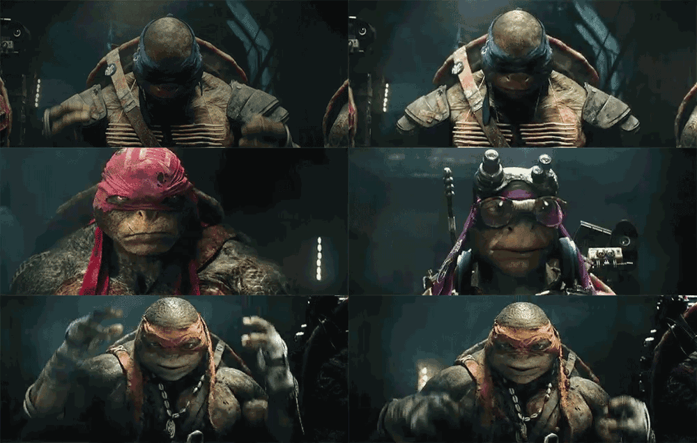
Anyone else loving the visual style of this movie?
I really love the look of this movie, some of the shots looks awesome. It has a very Mass Effect, Star Trek look to it. Speaking of Mass Effect, they are making a movie of it, I really wish they weren't because I don't see how it can work as a movie, but I hope that Mass Effect uses the same visual style as this movie. But here are some shots that I think demonstrate that:
 Spoiler:
 Spoiler:
    And the shot that demonstrates the awesome visual style more than any other Spoiler:
|

|

|
|
07-17-2014, 09:20 AM
|
#2 |
|
Stone Warrior
 
Join Date: Jan 2014
Location: NYC Sewers
Posts: 955
|
I really like the look of it.
__________________
 
|
|
|
|
|
07-17-2014, 09:26 AM
|
#3 |
|
Hench Mutant

Join Date: May 2014
Posts: 492
|
Has very nice cinematography and lighting and use of colors they just pop very cool
|
|
|
|
|
07-17-2014, 09:28 AM
|
#4 |
|
Stone Warrior

Join Date: Feb 2012
Location: UK, England
Posts: 546
|
Yes, the cinematography does look top notch. It also looks visually striking and fairly unique.
|
|
|
|
|
07-17-2014, 09:29 AM
|
#5 |
|
Stone Warrior

Join Date: Apr 2014
Posts: 702
|
Yea, it's pretty awesome and colorful. You can see the individual colors of the turtles within the lighting of almost every shot.
__________________
"Less rahk n' row, boys!" -Leuhnardoh 
|
|
|
|
|
07-17-2014, 09:33 AM
|
#6 |
|
Emperor

Join Date: Mar 2007
Posts: 7,909
|
Yes. The colors are very VIVID and I love that ray of lights that shimmer into the camera from time to time, glorious to behold. Like candy for the eyes.

|
|
|
|
|
07-17-2014, 10:27 AM
|
#7 |
|
Mad Scientist

Join Date: Sep 2012
Posts: 1,512
|
This is probably the most colourful movie I've seen since....Kick-Ass!
__________________
 Fav Quote - 87 Leo: "TURTLES FIGHT WITH HONOUR!" Fav Series - 2012 Nickelodeon Fav Game - Out of the Shadows Fav Comic - IDW Series Fav Movie - Liebesman's TMNT (2014) |
|
|
|
|
07-17-2014, 10:30 AM
|
#8 |
|
Team Blue Boy

Join Date: Jun 2014
Location: U.S., East Coast
Posts: 16,293
|
Yeah, Turtles may not be all too pretty to me, but cinematically speaking it collectively has a nice look to it.
|
|
|
|
|
07-17-2014, 02:14 PM
|
#10 | |
|
Kitchen Ninja

Join Date: May 2006
Location: I currently live in Cape may NJ im from Hillsboro Oregon
Posts: 2,788
|
IM loving the visuals they are awesome And i cant wait to See the full thing
__________________
 AVATAR ^_^ .... AVATAR ^_^ ....love you mom... Quote:
|
|
|
|
|
|
07-17-2014, 02:19 PM
|
#11 |
|
Weed Whacker

Join Date: Apr 2007
Location: Auburn, WA
Posts: 34,422
|
The visual look of the costuming and such? No, not at all. The cinematography and camerawork? Fairly brilliant, what I've seen so far.
__________________
|
|
|
|
|
07-17-2014, 02:42 PM
|
#12 |
|
Banned

Join Date: Mar 2003
Location: nWo Country
Posts: 27,703
|
Yeah I think the cinematography and camera work are gonna be highlights.
I'll agree it has sort of a Star Trek/Mass Effect look to it... but that's not something I really see in my head when I think "TMNT". It's slick, but feels a little too slick for this property's film. And as others have said, skin textures aside, I really can't stand the character designs. It looks like a lot of stuff I don't like the look of will at least be shot very well and look pretty. The lair's mostly okay; that, I wish they'd just dialed down about, say, 10%, where everything else I wish they toned down about 60-80%. |
|
|
|
|
07-17-2014, 03:07 PM
|
#13 |
|
Foot Soldier

Join Date: Apr 2014
Posts: 198
|
Yes, everything is very vivid and colorful. As the Black Nerd said: The color correction is TAIGHT!

|
|
|
|
|
07-17-2014, 03:32 PM
|
#14 | |
|
40 Years of TMNT

Join Date: Mar 2009
Location: Shell-Ri-La
Posts: 26,945
|
Quote:
|
|
|
|
|
|
07-17-2014, 05:16 PM
|
#15 |
|
Hench Mutant

Join Date: Sep 2012
Location: San Antonio, TX
Posts: 273
|
Seeing a lot of orange and teal.....
Item #4 http://www.cracked.com/article_18664...look-same.html http://theabyssgazes.blogspot.com/20...ease-stop.html http://****ingorangeandteal.tumblr.com http://www.slashfilm.com/orangeblue-...movie-posters/ The blocked out part of the tumbler link is the F word, by the way Last edited by mexichrist83; 07-17-2014 at 05:17 PM. Reason: censored |
|
|
|
|
07-17-2014, 06:24 PM
|
#16 | |
|
Stone Warrior

Join Date: Jan 2014
Location: Texas
Posts: 924
|
Quote:
__________________
Ninja Fox Games & Geekery: http://ninjafoxgames..com/ |
|
|
|
|
|
07-17-2014, 06:29 PM
|
#17 | |
|
Emperor
Join Date: Mar 2007
Posts: 7,909
|
Quote:
And they are gorgeous to look at! 
|
|
|
|
|
|
07-17-2014, 06:32 PM
|
#18 | |
|
Stone Warrior
Join Date: Jan 2014
Location: Texas
Posts: 924
|
Quote:
And I was paraphrasing Mikey's line about anchovies, btw
__________________
Ninja Fox Games & Geekery: http://ninjafoxgames..com/ |
|
|
|
|
|
07-17-2014, 07:16 PM
|
#19 |
|
So Long, Stinktown!

Join Date: Jan 2003
Location: Canada
Posts: 3,463
|
Just when I think I'm out...
 I actually really dislike the visual style of this movie, actually. I'll explain why, but for the sake of fairness: it's a totally subjective thing and I don't expect anyone to agree, necessarily. Okay? Okay!  But... I actually don't think it has "good" cinematography or camerawork at all, based on the trailers I've seen. I think it has very flashy cinematography and camerawork, and that has its appeal and is definitely popular with some folks, but to me it just seems really obnoxious and overly-busy. It's eye candy, but... there's a reason you get sick if you eat too much candy in one sitting.  The most effective storytelling is often the simplest. The flashy stuff is best used sparingly, and it's more effective because of it. But with this movie, it seems to be all flash: we seem to have the camera almost constantly moving, sweeping and bouncing around, while nearly every shot seems to have spotlights and smoke machines going off in the background. Seriously, look at those shots in the original post - smoke and heavy, artificial-looking filtering and bright lights and lens flares all over the place. And I know that some people really enjoy that, but I think it's totally obnoxious and distracting. And my worry about this, based on what I've seen so far, is that this movie's overall "look" is more concerned with being the cinematography equivalent of a fireworks show instead of offering any actual decent, legitimate storytelling - all flash, zero substance. If you haven't seen it yet, there's a great (and fair) video describing the overall Michael Bay style called "Bayhem" that sums up a lot of my issues with the look of this movie. (And I know that Bay didn't direct it, but this movie is very much in his style and follows his influence, so I think it's relevant.) IMO, and as it says in the video, that style is great at being flashy, but it's incredibly limited by its need to be flashy at all times, and it suffers because of that on a basic storytelling level. There's no subtlety and no nuance. And I don't care what kind of movie you're making -- even a silly action/comedy -- you need those things, even just a little bit, to make anything worth watching.
__________________
Last edited by Bry; 07-17-2014 at 07:45 PM. |
|
|
|
|
07-17-2014, 11:42 PM
|
#20 | |
|
trash

Join Date: Apr 2014
Location: Australia
Posts: 4,546
|
Quote:
FWIW, I can't stand lens flare either. *shrugs*
__________________
 Creator of the Technodrome After Dark Discussion Group. PM for an invite (must be over 18 - no exceptions). |
|
|
|
|
 |
|
|


 Linear Mode

