
|
 06-13-2017, 07:55 AM |
#1 |
|
Foot Elite
 Join Date: Feb 2010
Posts: 2,514
|
TMNT Old School Off Model Designs
I just bought the TMNT: Kickin It Old School Coloring Book.It's a colouring book for adults but also children. I've learned that there are adult colouring books you can buy which helps relieve stress so I thought I'd try it with this one. The book apparently contains 75 pages of colouring pages although this is incorrect as only the right page has a picture to colour so basically divide 75 by 2 and you get the correct number of images. The book mostly contains images of the FW Turtles along with images from Mirage Volume 1 and as well as a couple of Nick ones.
https://images-na.ssl-images-amazon....12h-6X54FL.jpg I'm bringing this up because I feel while the concept on the book is sound I'm a bit disappointed with the end result. Now the Mirage images are reprinted every well. Apologies for the large images, haven't figured out how to decrease the size of them: 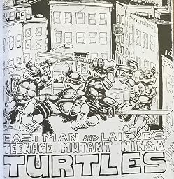 while the Nick cartoon has been faithfully transferred into 2D art. The problem I have is the FW art. Most if not all of it is obviosuly reprinted back from the 80s/90s which is where the problem lies. TMNT merchandise art back then was very inaccurate to the designs in the cartoon, check out Bebop and Rocksteady. The art as a result in the book looks like a cross between Archie and the Playmates toys:   The artists back then never seemed to get it right and I've always wondered about the creative decisions in replicating the FW series for stuff like toys, games and other stuff. As someone who enjoys the FW you can see I'm sort of disappointed. Was it really too much in this day and age to get artists to design more faithful art that looks like this?  Even if they took still images from the episodes that would have been better. So my question is does this kind of inaccuracy bother you now today and who created the simplistic designs for the merchandise in the first place? |

|

|
|
06-13-2017, 08:28 AM
|
#2 |
|
This ***** used to be Fun

Join Date: Mar 2016
Location: Aotearoa New Zealand
Posts: 5,376
|
Woah, never expected to see you not post on a Thursday.
Anyways, I personally have never been bothered by the different FW designs in merchandise since I don't buy any turtles merchandise at all. I imagine though that maybe those people who both watched the show and bought the toys/colouring books might've been irked by the designs being different from the show. For e.g. Many people loved the toy of Slash from the 80s but were dissapointed by his design in the show itself. |
|
|
|
|
06-13-2017, 10:46 AM
|
#3 |
|
40 Years of TMNT

Join Date: Mar 2009
Location: Shell-Ri-La
Posts: 26,945
|
I'm not bothered by any of the retro art because that old Lavigne/Brown stuff is infinitely classic to me, it's animated, it's my childhood. But I do totally hate all the modern OT inspired stock art, yeah. It's stiff, lifeless, oddly proportioned, & often features borderline emotionless expressions. I don't mind Fred Wolf turtles being somewhat off model as they've always been, but they could do so much better...
|
|
|
|
|
06-13-2017, 11:03 AM
|
#4 | |
|
Overlord

Join Date: Feb 2004
Location: Between yesterday and tomorrow!
Posts: 15,482
|
Quote:
__________________
 Experience the TMNT Fan Commentaries! Check out my TMNT fan comic, "Nothing to Fear"! View my sketch work! I'm selling some of my hard-to-find TMNT items! |
|
|
|
|
|
06-13-2017, 02:28 PM
|
#5 |
|
Team Blue Boy

Join Date: Jun 2014
Location: U.S., East Coast
Posts: 16,293
|
I suggested and got it as a gift this past Christmas. With the cover just being '87 and the title, I was expecting it to be entirely that version, but I was very happily surprised that it's a mix of '87, Nick, AND Mirage art. (The art style of the FW pages doesn't bother me too much really... If it was supposed to be redrawn direct images from the series or old art it would bug me more, but this is largely the 21st century model of them.)
I also love that the tone varies, from cool gritty Mirage stuff to a few cute things that might be on a girl's t-shirt.  Personally I'd recommend this, even just to have if not actually color. Not sure if I'll ever color any of mine. (I MIGHT sooner or later scan a few pages and add color digitally instead.) edit: I think the only thing that bugs me about some of today's version of 'retro' FW stuff is when the four have a mix of expressions (between big smiles and looking serious) and they give the big grins to Leo and/or Raph...the two more apt to be putting on a fierce look. Not that Donnie and Mikey can't look like that, but if those two are, it just looks a little strange to me to have Leo and Raph beside them looking like they just OD'd on happy pills. I do love the Leo on the skateboard in that one image... had considered scanning that eventually. Last edited by IndigoErth; 06-13-2017 at 02:47 PM. |
|
|
|
|
06-13-2017, 09:16 PM
|
#6 |
|
Overlord

Join Date: Jan 2004
Posts: 15,692
|
The turtles always had that weird extra.. . Surrounding line that circled itself around the turtles' um... front shell plates, or whatever you'd call them. The original action figures had them, the stock art had them and even the cgi versions of the OT tmnt had them in Transdimensional Turtles, but they never had them in the cartoon itself.
__________________
"I was down with TMNT once, but then they changed what TMNT was. Now what I was down with is no longer TMNT and what TMNT now is seems weird and scary. And it'll happen to YOU." Check out my blog for Comic Reviews and other things. https://markepicblogofrandomness.blogspot.com/ I also started The AEW Crew, the All Elite Wrestling Fan Club! https://www.facebook.com/groups/637508120044168/ |
|
|
|
|
06-13-2017, 09:35 PM
|
#7 |
|
Foot Elite

Join Date: Sep 2015
Location: WA
Posts: 2,507
|
This thread makes me want to actually start coloring in mine. I am not much of an artist, so having all these images ready is great. I can pretend I'm an artist for awhile. IndigoErth I like your idea of adding color digitally. I want to use something other than crayons or colored pencils. However digitally is beyond my capabilities. I heard about Copic markers but don't want to spend that much. Also need something that won't soak through the pages. Hmm.
__________________
Find me on Instagram @turtle_wa YouTube @TurtleWA 
|
|
|
|
|
06-14-2017, 01:14 AM
|
#8 |
|
Spooky ghost

Join Date: Aug 2013
Location: Western Australia
Posts: 2,266
|
I love the weird old merchandising art, but I guess it's mostly because of nostalgia. It reminds me of being a kid and seeing Turtles stuff everywhere. I have fond memories of knock-off t-shirts with bad colour registration, and images in the TV guide where all the weapons were mixed up.
Consistency is a laudable goal to a degree, but you have to be a bit flexible. As ropy as some of that old animation was, it was warm and charming in a way that more tightly controlled stuff isn't. Compare the OT to Fast Forward. There are a lot more mistakes in the former, but I find it more appealing and fun to look at.
__________________
ProactiveMan! 
|
|
|
|
|
06-14-2017, 05:38 AM
|
#9 |
|
Foot Elite

Join Date: Dec 2003
Posts: 3,050
|
This art was on EVERYTHING in the '80s - napkins, birthday hats, etc. Maybe it holds a bit of nostalgia for me. I'm glad they used this classic Brown/Lavigne art instead of the newer "retro" art for this book. Sounds like a pretty cool coloring book to me.
|
|
|
|
|
06-14-2017, 03:39 PM
|
#10 | |
|
40 Years of TMNT
Join Date: Mar 2009
Location: Shell-Ri-La
Posts: 26,945
|
Quote:
|
|
|
|
|
|
06-15-2017, 09:34 AM
|
#11 | ||||
|
Foot Elite
Join Date: Feb 2010
Posts: 2,514
|
Quote:
Quote:
Quote:
Quote:
|
||||
|
|
|
|
06-15-2017, 02:03 PM
|
#12 |
|
40 Years of TMNT
Join Date: Mar 2009
Location: Shell-Ri-La
Posts: 26,945
|
You already did, the shot with colored pencils laid over it.
|
|
|
|
|
06-15-2017, 02:57 PM
|
#13 | |
|
Foot Elite
Join Date: Feb 2010
Posts: 2,514
|
Quote:

|
|
|
|
|
|
06-15-2017, 05:36 PM
|
#14 |
|
40 Years of TMNT
Join Date: Mar 2009
Location: Shell-Ri-La
Posts: 26,945
|
It's hardly indistinguishable... I know you get a lot of crap around here, I don't wanna dogpile you, but c'mon, man. There are dozens of differences in both style & design, not to mention you can tell one's digital & the other traditional.
|
|
|
|
|
06-22-2017, 09:29 AM
|
#15 | |
|
Foot Elite
Join Date: Feb 2010
Posts: 2,514
|
Quote:
|
|
|
|
|
|
06-22-2017, 05:20 PM
|
#16 |
|
Foot Elite
Join Date: Dec 2003
Posts: 3,050
|
For one thing, the linework in the second image looks more wispy and rushed, while the 3rd picture's linework is more refined. The Turtles are "puffier" in the 3rd pic. Also, it looks like a completely different artist drew the two pictures, which is the case. I think the artist of the second picture was trying to capture Brown and Lavigne's classic style, but didn't quite get it right.
|
|
|
|
|
06-23-2017, 02:13 AM
|
#17 |
|
The Agenda of Existing

Join Date: Dec 2008
Location: Vikingland
Posts: 14,596
|
The Retro art have some weird proportions, got stiff poses and looks flat/lifeless. Kinda looks like someone traced a FW Turtle over something else.
|
|
|
|
|
06-29-2017, 08:42 AM
|
#18 | |
|
Foot Elite
Join Date: Feb 2010
Posts: 2,514
|
Quote:
|
|
|
|
|
 |
|
|


 Linear Mode


