
|
|
|||||||
| View Poll Results: What is your favorite TMNT logo? | |||
| Original Mirage |
   
|
7 | 21.21% |
| Fred Wolf/Archie |
  
|
18 | 54.55% |
| 1990's movies |
  
|
6 | 18.18% |
| City at War |
  
|
0 | 0% |
| Next Mutation |
  
|
0 | 0% |
| 4Kids |
  
|
1 | 3.03% |
| 2007 Movie |
|
0 | 0% |
| Back to the Sewer |
|
0 | 0% |
| Nickelodeon series |
|
0 | 0% |
| Other (Hero turtles, Tales of the TMNT, etc.) |
|
1 | 3.03% |
| Voters: 33. You may not vote on this poll | |||
 |
|
|
Thread Tools | Display Modes |
 11-16-2011, 08:29 AM |
#1 |
|
Foot Elite
 
Join Date: Jul 2011
Location: USA
Posts: 3,447
|
What is your favorite TMNT logo?
The franchise had introduced several logos over the years which represents a different unit of the multiverse, beginning with the original Mirage logo (which has made a comeback recently with the IDW series) and concluding with the Nickelodeon 2012 series logo. But which of these is your favorite?
NOTE: I just signed up with a Photobucket account and this evening will provide the logos side-by-side with each other.
__________________
http://forums.thetechnodrome.com/sho...d.php?t=37065- MY WANT LIST TMNT FAN CLUB LINK: http://sot.ag/gCjK/ 30 years of Turtle Power! Last edited by pannoni1; 11-16-2011 at 08:34 AM. |

|

|
|
11-16-2011, 08:33 AM
|
#2 | |
|
幸 - 愛 - 思う

Join Date: Jun 2009
Location: St. Louis
Posts: 2,824
|
Quote:
-ms
__________________

|
|
|
|
|
|
11-16-2011, 08:40 AM
|
#3 |
|
Mad Scientist

Join Date: Jul 2007
Location: Illinois
Posts: 2,152
|
My favorite is also the OT logo.
__________________
|
|
|
|
|
11-16-2011, 09:17 AM
|
#4 |
|
Thug

Join Date: Dec 2009
Location: Ashford, Kent, UK
Posts: 77
|
My favourite was the OT logo as well.
|
|
|
|
|
11-16-2011, 10:33 AM
|
#5 |
|
Stone Warrior

Join Date: Sep 2011
Posts: 916
|
ot logo was mine to but I do really like the 2k3 series logo when it was spelled out like the ot logo was.
|
|
|
|
|
11-16-2011, 11:16 AM
|
#6 |
|
Technodrome Technician

Join Date: Sep 2009
Location: third earth
Posts: 4,737
|
Sorry got to go with the OT logo as im sure as most will....and no its not for nostalgia either I jst like the design of it and its jst really simplistic, but well designed.
__________________
GT:Reedeamer THE TECHNODROME REDESIGN 2015 http://forums.thetechnodrome.com/showthread.php?t=51594 
|
|
|
|
|
11-16-2011, 03:02 PM
|
#7 |
|
40 Years of TMNT

Join Date: Mar 2009
Location: Shell-Ri-La
Posts: 26,956
|
For the rainbow universes, the OT logo is my favorite. For the comics, I like the Image logo. Real bold & clean, often with cool gradient colors.
Vote will go to the OT, though, 'cause it's there. |
|
|
|
|
11-16-2011, 04:44 PM
|
#8 |
|
Col. Stinkmeaner
Join Date: Mar 2007
Posts: 19,363
|
The logo from Mirage Volume 1 #1 is where it's at. Nothing will ever top it as far as I'm concerned.
|
|
|
|
|
11-16-2011, 04:55 PM
|
#9 |
|
Mad Scientist

Join Date: Oct 2010
Location: Chicago sewer
Posts: 2,488
|
OT, Mirage Its a one two combo.
|
|
|
|
|
11-16-2011, 06:11 PM
|
#10 |
|
Foot Elite
Join Date: Jul 2011
Location: USA
Posts: 3,447
|
Well, here are all the logos side-by-side:
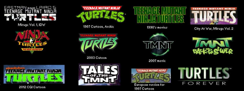 My ranking, from best to worst: 1. 1987 Cartoon. Classic. Will always be the logo I envision first when I think "Ninja Turtles". 2. Mirage Vol.1/IDW Comics. The origin of the TMNT, and fits the edgier nature of the comics fine. 3. Nickelodeon Cartoon. A cool design for today's era; I hope you start recognizing this more just like you did for the 4kids logo. 4. City At War. Has some influences from 1987 with the white on red horizontal bar, but a nice then-contemporary design. 5. 1990's movie. While a bit blocky, it's still a classic. 6. 2003 Cartoon. While the colors preserve the spirit of the original and the letters show it's a new generation, it's not quite "that's the Ninja Turtles!" to me. 7. Turtles Forever. A nice, contemporary logo that sums up 25 years of a franchise, though not quite as memorable. 8. 2007 movie. A bit edgier, this embodies the 2000's boho-spirit, but I'm not really fond of it. 9. Back to the Sewer. The lettering looks a bit cheap, but at least it tries to show that it's part of the Turtles! 10. Tales of the TMNT. Very banal and basic. 11. The Next Mutation. Oh no, since when did the Ninja Turtles become some Samurai b-movie? I have no comment on TMHT since it's not part of my territory.
__________________
http://forums.thetechnodrome.com/sho...d.php?t=37065- MY WANT LIST TMNT FAN CLUB LINK: http://sot.ag/gCjK/ 30 years of Turtle Power! Last edited by pannoni1; 02-22-2012 at 12:49 PM. |
|
|
|
|
11-16-2011, 06:17 PM
|
#11 |
|
Foot Elite

Join Date: Dec 2003
Posts: 3,051
|
The '80s cartoon logo is the most original, iconic, and it's easily recognizable in a split second. A very impactful logo. Anyone know who designed it? Someone at Playmates?
|
|
|
|
|
11-16-2011, 06:27 PM
|
#12 |
|
Something from the Past

Join Date: Nov 2007
Location: New York
Posts: 3,256
|
Close call, but I'm going to say the 1990 movie logo. It's pure awesomeness. Second would be Mirage.
|
|
|
|
|
11-16-2011, 07:37 PM
|
#13 |
|
Thug

Join Date: Apr 2010
Posts: 73
|
I have to go with the OT as well.
Looking at all of them now side by side its the one that jumps out at me first. Whoever came up with it really made sure the logo would quickly catch the eye. The 2003 logo is also good, followed by the movie logo. A lot of them are pretty bad though. |
|
|
|
|
11-17-2011, 04:46 PM
|
#14 |
|
Emperor

Join Date: Feb 2009
Location: Portugal
Posts: 9,999
|
OT's followed by 2k3's toon.
|
|
|
|
|
11-17-2011, 05:13 PM
|
#15 |
|
Rat-faced Dude-guy
 
Join Date: Feb 2004
Location: Arkansas
Posts: 26,301
|
I agree with Powder...where's the Image TMNT logo?
__________________
 "Clearly, you're Ninja Turtling incorrectly." - Leo656 |
|
|
|
|
11-17-2011, 05:14 PM
|
#16 |
|
幸 - 愛 - 思う
Join Date: Jun 2009
Location: St. Louis
Posts: 2,824
|
No Image logo?
-ms
__________________
|
|
|
|
|
11-17-2011, 06:51 PM
|
#17 |
|
Overlord

Join Date: Feb 2004
Location: Between yesterday and tomorrow!
Posts: 15,501
|
I love how basic the original live-action movie's logo looked. It suggests that's all the kid's really needed to know in order to get excited about the film: Teenage. Mutant. Ninja. Turtles. Nuff' said!
Starting @ 0:38: http://www.youtube.com/watch?v=3Urnzz-eXO8 I also like how each adjective gets the same weight. Most logos emphasize "Turtles" but its that "Teenage Mutant Ninja" description that proved to be the hook that got most people interested in the franchise.
__________________
 Experience the TMNT Fan Commentaries! Check out my TMNT fan comic, "Nothing to Fear"! View my sketch work! I'm selling some of my hard-to-find TMNT items! |
|
|
|
|
11-17-2011, 07:05 PM
|
#18 | |
|
Mad Scientist

Join Date: May 2011
Location: United States
Posts: 1,550
|
Quote:
1.The original is the original. It's cool.  I know IDW has done the same thing, but since I don't like their interpretation, I can't say I like IDW's version. No one can beat the very first!  2. 80's OT toon: my absolute favorite. I grew up with this logo.  3.The movie one is not bad. It reminds me of the Mirage style. 4.The logo for City at War looks okay. 5.TNM is not bad, but not fantastic. 6.2k3 series: New and original. I like the logo better than the toon and its theme song. 7.2k7 film: This logo is inspirational. Probably, my all time favorite, second to the OT style. 8.Back to the Sewers: Can someone say, "Cheesey?"  This one is awful. 9.Nickelodeon: This reminds me of the Mirage style, but taken to another level. I like it. 10.Tales of the TMNT: Interesting. Not great, but good. 11.The word "Hero" takes away the magic.  12.Turtles Forever: Very boring. It needs more flair. So, I have a few favorites. I can't choose one. 
|
|
|
|
|
|
11-17-2011, 07:55 PM
|
#19 |
|
40 Years of TMNT
Join Date: Mar 2009
Location: Shell-Ri-La
Posts: 26,956
|
Way to not include the Image logo, pan...
Allow me.  For that matter you're also passing over TMNT (as in vol. 4). |
|
|
|
|
11-17-2011, 09:08 PM
|
#20 | |
|
Mad Scientist
Join Date: May 2011
Location: United States
Posts: 1,550
|
Quote:
|
|
|
|
|
|
|
|


 Linear Mode


