
|
|
|||||||
| View Poll Results: Vote for your favorite overall Ninja Turtle look. | |||
| 1st Live Action movie |
   
|
10 | 13.51% |
| 2nd Live Action movie |
  
|
1 | 1.35% |
| 3rd Live Action movie |
  
|
0 | 0% |
| 2007 CG Movie |
  
|
6 | 8.11% |
| 80's Cartoon |
  
|
13 | 17.57% |
| 2k3 Cartoon |
  
|
14 | 18.92% |
| Nick Cartoon |
|
10 | 13.51% |
| Mirage Comics |
|
16 | 21.62% |
| Next Mutation |
|
1 | 1.35% |
| Other |
|
3 | 4.05% |
| Voters: 74. You may not vote on this poll | |||
 |
|
|
Thread Tools | Display Modes |
 01-14-2013, 08:39 PM |
#1 |
|
Stone Warrior
 
Join Date: May 2006
Location: WA
Posts: 861
|
What is your overall favorite look of the Ninja Turtles?
What is your overall favorite look of the Ninja Turtles?
1. 1st Live Action movie 2. 2nd Live Action movie 3. 3rd Live Action movie 4. 2007 CG Movie 5. 80's Cartoon 6. 2k3 Cartoon 7. Nick Cartoon 8. Mirage Comics 9. Next Mutation 10. Other |

|

|
|
01-14-2013, 08:47 PM
|
#2 |
|
Hench Mutant

Join Date: Sep 2012
Posts: 351
|
#1 ? Hard one,going to have to go with 1990 original live action film for nostalgic reasons.Honorable mentions 2007 cgi,4kids cartoon series and nick.Also for its time the 80sthe series still holds up pretty well.
|
|
|
|
|
01-14-2013, 08:52 PM
|
#3 |
|
Rat-faced Dude-guy
 
Join Date: Feb 2004
Location: Arkansas
Posts: 26,300
|
Mike Dooney.
__________________
 "Clearly, you're Ninja Turtling incorrectly." - Leo656 |
|
|
|
|
01-14-2013, 09:11 PM
|
#4 |
|
Foot Soldier

Join Date: Oct 2012
Location: CT
Posts: 182
|
I went "other" because my favorite look is the new action figures, which aren't quite 'toon accurate, yet have a ton of personality. Kinda the perfect marriage between the new show and everything that came before.
|
|
|
|
|
01-14-2013, 09:34 PM
|
#5 |
|
Col. Stinkmeaner
Join Date: Mar 2007
Posts: 19,341
|
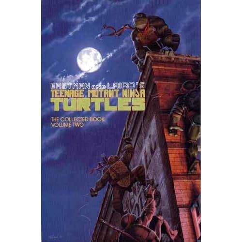
I voted Mirage, but that's kind of weird option considering they had about 15 different designs in various significant stories. But I voted Mirage for A.C. Farley's painted covers. I can only dream they'll use them as a basis for the upcoming movie.
|
|
|
|
|
01-14-2013, 09:36 PM
|
#6 |
|
Fashionably late

Join Date: Aug 2004
Location: CA
Posts: 4,146
|
Michael Dooney's style has always been my favorite look.
__________________
"If only we'd stop trying to be happy, we could have a pretty good time" E.W 
|
|
|
|
|
01-14-2013, 10:50 PM
|
#7 | |
|
Overlord

Join Date: Dec 2004
Posts: 43,869
|
Quote:
|
|
|
|
|
|
01-14-2013, 11:11 PM
|
#8 |
|
Mad Scientist

Join Date: Sep 2012
Posts: 1,579
|
Nick version for me.
|
|
|
|
|
01-14-2013, 11:23 PM
|
#9 |
|
Stone Warrior

Join Date: Mar 2011
Location: Lawrenceville,Georgia
Posts: 780
|
The Look of the First Movie Turtles is my favorite.
|
|
|
|
|
01-15-2013, 12:25 AM
|
#10 |
|
Foot Elite

Join Date: Aug 2006
Location: AZ
Posts: 3,513
|
I was just think of all the designs over the years a couple weeks ago.
Through process of elimination I picked 2k3. Original comic (I know theyve changed throughout but generally the first designs are what is remembered) This is actually my least favorite. Theyre too short and saggy imo. Necks are too long too. OT - ok but a little too cute be taken seriously. Live Action - cool but also kinda scary? in a way...hard to describe. I was never afraid of them but they do kinda look intimidating. In a big creepy reptile kinda way. I dont know. CGI Movie - too skinny and Popeye-ish. Nick - nice but on the square-hard edges side. 2k3 - theyre the right height, look tough and dont have over exaggerated proportions.
__________________
Nothing can survive the will to stay alive, cause if you try, you can do anything. |
|
|
|
|
01-15-2013, 02:35 AM
|
#11 |
|
Emperor

Join Date: Mar 2007
Posts: 7,909
|
2007 CGI movie, followed closely by Nick's TMNT.
 
|
|
|
|
|
01-15-2013, 03:24 AM
|
#12 |
|
Ninjutsu Master

Join Date: Jul 2012
Location: Bay Area, CA
Posts: 6,418
|
Well this is tough. I'm going with Nick. Mirage is awesome and great for its time. I'm still very fond of it. But I think the Nick direction is perfect for the characters.
I'm also a huuuge fan of the 1990 live action film. The costumes look GREAT but it's not ideal at all. It's about as good as it could possibly be for 1990 so I will always respect it for that. But It does bother me how big and bulky they look. They don't look like teenagers... they look like BODYBUILDERS! Not sleak ninjas. I love the Nick style because the turtles look how I feel a 15yo mutant turtle should look like... a little lanky and not huge and bulky Not as big a fan of TMNT II and III I actually feel the costumes got WORSE in those films. Especially the faces which look more and more weird and use strange expressions that look... goofy. In the first live action film they keep that toned down. TMNT II and III were such huge missed opportunities. LOL @ including next mutation. You trolling, son? I wish there were an IDW option but they keep changing artists so I'm not sure I really feel it has a cohesive style at this point. |
|
|
|
|
01-15-2013, 05:14 AM
|
#13 |
|
Guest
Posts: n/a
|
I voted for the ot turtles, i just love hand drawn animation. The Neca turtles looks great to, if that were an option.
|
|
|
|
01-15-2013, 08:14 AM
|
#14 |
|
That whack job behind you

Join Date: Oct 2002
Location: Carlisle, Pennsylvania
Posts: 8,143
|
For some reason I always loved their costumes in Secret of the Ooze. I guess it was how it seemed like this blend of the costumes from the original movie with a little more influence from the cartoon.
__________________
"I like it. Simple, but effective!"  Raphael; The Mean Machines - 1988 
|
|
|
|
|
01-15-2013, 08:55 AM
|
#15 |
|
Foot Soldier

Join Date: Jan 2013
Location: Savannah, GA
Posts: 198
|
2007 Movie
The original movie ones were good for their time but honestly too tall, too clunky and too muppet looking. 2007 looked really good, then 2003 series then Nick
|
|
|
|
|
01-15-2013, 09:04 AM
|
#16 |
|
Space Cowboy

Join Date: Dec 2011
Location: Speed Force
Posts: 7,043
|
The Nick version. I really like how the turtles actually look like kids in this show and that they each have their own unique design.

__________________
 |
|
|
|
|
01-15-2013, 09:36 AM
|
#17 |
|
Foot Elite
Join Date: Mar 2010
Posts: 3,045
|
Were the looks from the first and second film even different?
|
|
|
|
|
01-15-2013, 09:55 AM
|
#18 |
|
Superhero musician

Join Date: Feb 2003
Location: Dallas, Texas
Posts: 2,191
|
 Gotta like the sashes.
__________________
 Mikey drums with nunchucks! |
|
|
|
|
01-15-2013, 10:19 AM
|
#19 |
|
Mad Scientist

Join Date: May 2011
Location: United States
Posts: 1,550
|
For the movies, I felt that Movie 1 had the best realistic mutated turtle designs.
 They were great. Unfortunately, by the last two movies, the costumes became sort of fake. It wasn't bad in the second one, but by the third film, they looked like old rubber costumes with bad animatronics. The Next Mutation, however, was so fake, they screamed "cheap rubber seen on Power Rangers." Also, I hated those bandages wrapped around their legs. They looked like soccer socks.  The OT turtles are classic, of course. They are not only cool, but they do have this appeal to them as if they were friends with Kermit the Frog. No wonder Jim Henson was involved with the first movie.  By the 2k3 series, they looked cooler and edgier, but sometimes, I feel that white eyes don't really work for cartoon ninja turtles. Only for Batman or Wolverine. Still, it was not a bad design.  Fast Forward had them look crazy like it was a gimmick to sell toys of them in weird outfits. How do I say this: annoying. For the comics, I say I really liked the turtle designs that were drawn by Kevin Eastman. They looked fantastic. Then by the IDW comics, they had Dan Duncan draw the turtles. They might look a bit realistic, but they were ugly. I'm sorry. He can't draw the turtles. Humans, he's fine with. Turtles, no. All their jaws seemed unproportional.  Also, this new artist who's drawing the turtles is just as bad, too. It's like he didn't bother to erase the sketch lines that weren't needed.  Now for my answer - while I liked the look for the CGI turtles in the 2k7 film, I must say that I now I really love the design of the CGI turtles in the 2k12 series on Nickelodeon. Ever since The Next Mutation, I didn't want the turtles to wear bandages, especially if they reached up to their knees and elbows. That changed once I saw the designs of these new turtles. I actually thought they were going to wear the same color bandages, but as soon as I discovered that they were wearing ones of different colors, that was cool. Best part was the bandages were not up to their knees or elbows. In fact, I even love now that they have three toes. Yes, they're not that three-dimensional, but I still think it makes sense. 6 fingers now with six toes. It works. Yet, I even like how scaley the turtles look, as if they resemble the ones from the first movie. Even Michelangelo has freckles. Raphael even has that chip on his plastron, which is cool. Things I'm not down on, however, are just little nitpicks. Donatello's gap is kind of ridiculous, but it does make him nerdy. Plus, he's the tallest. I guess age doesn't always represent height, but I sure wish Leonardo was the tallest. Here's hoping he is in the next incarnation of the TMNT. Still, the Nick series designs are my favorite look for the turtles now. |
|
|
|
|
01-15-2013, 10:21 AM
|
#20 | |
|
Space Knight

Join Date: Jun 2007
Location: Colorado
Posts: 3,637
|
Quote:

__________________
|
|
|
|
|
|
| Tags |
| 4kids, fred wolf series |
|
|


 Linear Mode


