
|
 01-03-2015, 09:11 PM |
#1 |
|
Ninjutsu Master
 
Join Date: Jul 2012
Location: Bay Area, CA
Posts: 6,418
|
TMNT 2014 Unused designs/concepts
Sorry if old, I did a search for the artist's name and didn't find anything posted since 2013 on him.
the artist's blog: http://jeradsmarantz.blogspot.com/20...s-designs.html article about this: http://screenrant.com/tmnt-2014-turt...pt-art-images/  So what do you think? Better? Worse? |

|

|
|
01-03-2015, 09:15 PM
|
#2 | |
|
Space Cowboy

Join Date: Dec 2011
Location: Speed Force
Posts: 7,043
|
Quote:
__________________
 |
|
|
|
|
|
01-03-2015, 09:33 PM
|
#3 |
|
40 Years of TMNT

Join Date: Mar 2009
Location: Shell-Ri-La
Posts: 26,955
|
Donnie looks good, Splinter's cool except for the long ass skeletal arms & huge hands. The rest is wack. I've hated pretty much everything TMNT this guy has done.
|
|
|
|
|
01-03-2015, 09:37 PM
|
#4 |
|
Mad Scientist

Join Date: May 2005
Location: Pennsylvania
Posts: 1,994
|
I could've went for this. He actually looks more youthful. It always amazes me how they turn the concepts down that actually made sense and looked good in favor of something that misses the mark.
|
|
|
|
|
01-03-2015, 09:40 PM
|
#5 |
|
Disgusting

Join Date: Jan 2013
Location: Outer Heaven
Posts: 12,231
|
Besides splinters arms and Raphs whatever the hell that is, these look good.
|
|
|
|
|
01-03-2015, 09:47 PM
|
#6 |
|
Mad Scientist
Join Date: May 2005
Location: Pennsylvania
Posts: 1,994
|
Raph actually looks pretty cool but yeah, those spikes are really funky.
|
|
|
|
|
01-03-2015, 09:52 PM
|
#7 |
|
Stone Warrior

Join Date: Jun 2011
Location: 'merica
Posts: 731
|
These look a little too much like aliens...and Splinter's face is too shmushed in, I prefer a longer snout on Splinter. The more I watch the new movie, the more I start to like some of the small things they did in the design for the turtles. But that photoshop edit of 2014 movie Leo with the more oldschool Turtle design is by far the best look.
__________________
Oh you don't like my opinion? ---->  
|
|
|
|
|
01-03-2015, 09:53 PM
|
#8 |
|
Banned
 Join Date: Feb 2012
Posts: 3,954
|
The countdown to a closed thread is on!
 The thing that bothers me most about all the concept art, is that the scales and details are random, and odd. The nostils are odd, and the overall impression is of a flintstone dinosaur in it's proportions. This version has a youthful vibe, which I do prefer, but again looks like a cartoon, and if you're going to do a cartoon, it should look cool. I prefer this, personally, if it's not going to be realistic.  Krang looks derivative, and forgettable. Rocksteady looks like doomsday from smallvile. Not a compliment.  Looks like he pulled the Krang and B&R designs...not a good sign. Leo's mouth looks like he's wearing one of those ape masks from POTA 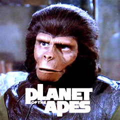 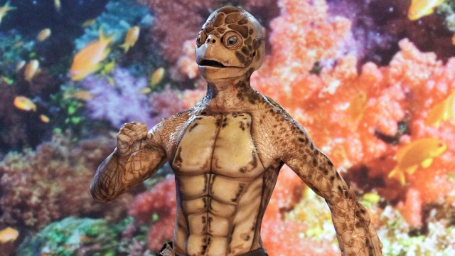
Last edited by Commenter 42; 01-03-2015 at 10:04 PM. |
|
|
|
|
01-03-2015, 10:00 PM
|
#9 |
|
Mutant Tiger

Join Date: Sep 2002
Location: Hialeah, Florida, USA
Posts: 14,165
|
Here are the other concept art of Krang and Bebop and Rocksteady, I can't find these images anywhere else for some reason, Comicbookmovie had to take down some images, I wonder if it were these.
Spoiler:
|
|
|
|
|
01-03-2015, 10:07 PM
|
#10 |
|
Banned
Join Date: Feb 2012
Posts: 3,954
|
Why rocksteady has spikes on his shoulders, is beyond me.
Rhino's don't have shoulder spikes. Spoiler:
|
|
|
|
|
01-03-2015, 10:08 PM
|
#11 |
|
Mad Scientist

Join Date: Aug 2008
Location: Boston MA
Posts: 2,440
|
would not surprise me if B&R are closer to those designs in TMNT 2
__________________
I didn't choose the ninja turtle life. The ninja turtle life chose me.   https://www.facebook.com/TheBostonNinjaTurtle |
|
|
|
|
01-03-2015, 10:13 PM
|
#12 | |
|
Banned
Join Date: Feb 2012
Posts: 3,954
|
Quote:
The antithesis of what fans want. |
|
|
|
|
|
01-03-2015, 10:16 PM
|
#13 | |
|
Mad Scientist
Join Date: Aug 2008
Location: Boston MA
Posts: 2,440
|
Quote:
and yea they will be given more human facial features
__________________
I didn't choose the ninja turtle life. The ninja turtle life chose me. https://www.facebook.com/TheBostonNinjaTurtle |
|
|
|
|
|
01-03-2015, 10:17 PM
|
#14 |
|
Foot Elite

Join Date: Mar 2012
Posts: 4,390
|
Ugh..Bebop and Rocksteady look terrible.
Lol at Goro Krang. |
|
|
|
|
01-03-2015, 10:22 PM
|
#15 | |
|
Banned
Join Date: Feb 2012
Posts: 3,954
|
Quote:
My real question is, if I can easily pick apart these designs, then what the f is going through the producers minds? Who can't see how terrible these all look! Ugly is ugly, no matter where you live. |
|
|
|
|
|
01-03-2015, 10:32 PM
|
#16 |
|
Foot Elite

Join Date: Feb 2005
Posts: 3,009
|
Those look better than we got in the sense that anything that resembles the standard TMNT works better for me...apart from Raphael. Seriously WTF
 I couldn't imagine watching that for even the short period of screen time the characters. It actually makes the hulking version of Raphael paletteable. I don't understand why all these designs seem to drastically set Raph apart then again I don't understand why they want such drastic redesigns in the first place. Bebop and Rocksteady look okay (are they by the same artist) although I prefer the other concept art we saw of them. As someone else on here mentioned you don't really see punks dress like they do anymore and I can only imagine how ridiculous human actors would look in that garb if they wanted to portray them pre-mutation. I'd say have them more like regular thugs and maybe post mutation have them more the standard Bebop & Rocksteady ala the other concept art we saw inspired by the Fred Wolf show if they are really desperate to go down that rout. |
|
|
|
|
01-03-2015, 10:37 PM
|
#17 |
|
Hench Mutant

Join Date: Oct 2014
Location: New Zealand
Posts: 406
|
 The first two are f*ckin perfect. But you know the other two will be closer to what we'll wind up getting...  Werewolf Bebop Fresh Out Of Prison looks like nightmare fuel. That Rocksteady is too spike-heavy but would look great with clothes & guns. That Krang is AWESOME & really hits home how somewhere in the next four years, we're gonna have Krang in a movie.
__________________
 "They were many. But we kicked... We fought well." |
|
|
|
|
01-03-2015, 10:37 PM
|
#18 |
|
Team Blue Boy

Join Date: Jun 2014
Location: U.S., East Coast
Posts: 16,295
|
Came across those, including the Krang stuff. The Krang designs are kinda wild. o.O They do look younger, but have to agree with the sentiment though that the Turtles look kinda alien.
I can't remember if it was here or elsewhere that I'd seen a comment pointing out how the Turtles looks went quite human, yet Splinter...not at all. And then soon after I saw that Splinter art. That Raph would probably be super grouchy, that skin does not look fun to live in. lol I have to be honest, as Bebop and Rocksteady aren't characters I'm too attached to, I do look forward to seeing how that turns out and what kind of approval or uproar happens... |
|
|
|
|
01-03-2015, 10:40 PM
|
#19 |
|
Banned
Join Date: Feb 2012
Posts: 3,954
|
This photo was taken this year
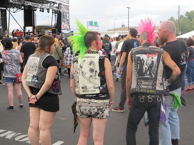 It may not be common in American suburbs, but you can easily find punks in New York still. Not everyone is a hipster these days 
|
|
|
|
|
01-03-2015, 10:44 PM
|
#20 | |
|
Banned
Join Date: Feb 2012
Posts: 3,954
|

Quote:
Just a mess of lazy painting. None of this art is exciting, more like drab and lifeless. |
|
|
|
|
 |
|
|


 Linear Mode


