The Technodrome Forums

Go Back   The Technodrome Forums > TMNT Universes > TMNT Movie Discussion > Platinum Dunes TMNT Movie Discussion

Notices

Reply
 
Thread Tools Display Modes
Old 06-09-2014, 03:38 PM   #61
TrickOrTreater
Samhain
 
TrickOrTreater's Avatar
 
Join Date: Jul 2013
Posts: 3,277
Quote:
Originally Posted by Galactus View Post
Considering that in the initial design process for the character they tried a different look but the mutual agreement of everyone that it worked best as a more simple realistic look then I'd sat that "over the top" is certainly NOT how the character was meant to be.

Also this Shredder looks ridiculous. When he draws his extra blades it looks like his hands are peacocking.
Such wasted potential.
__________________


Quote:
Originally Posted by CylonsKlingonsDaleksOhMy View Post
Some men use knives and guns, but TrickOrTreater is a more dangerous villain. He. Uses. The. TRUTH.
TrickOrTreater is offline   Reply With Quote
Old 06-09-2014, 04:04 PM   #62
The Boston Ninja Turtle
Mad Scientist
 
The Boston Ninja Turtle's Avatar
 
Join Date: Aug 2008
Location: Boston MA
Posts: 2,440
Quote:
Originally Posted by Galactus View Post

Also this Shredder looks ridiculous. When he draws his extra blades it looks like his hands are peacocking.
__________________
I didn't choose the ninja turtle life. The ninja turtle life chose me.


https://www.facebook.com/TheBostonNinjaTurtle
The Boston Ninja Turtle is offline   Reply With Quote
Old 06-09-2014, 05:23 PM   #63
Puddinpop
Banned
 
Join Date: Mar 2014
Location: Tampa Florida
Posts: 864
Quote:
Originally Posted by FellowChucker View Post
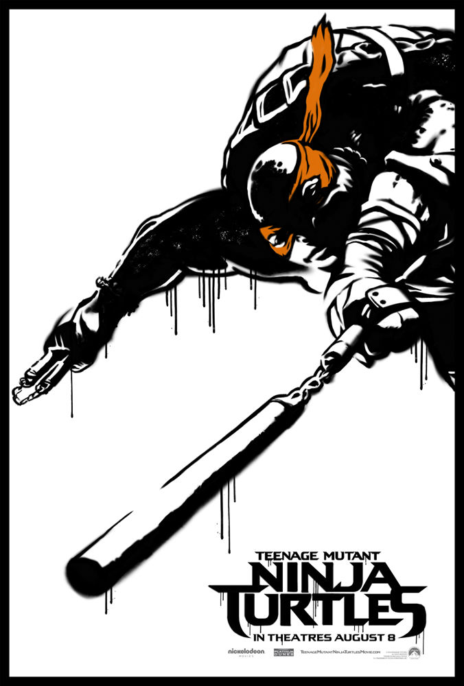
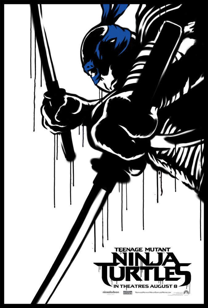
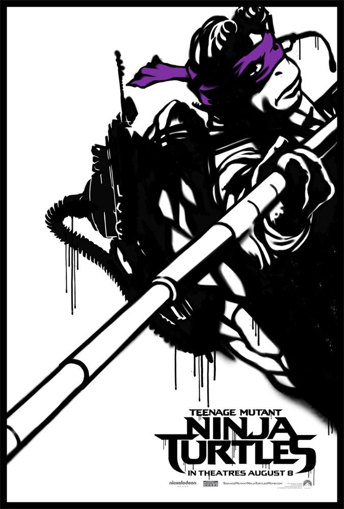
These are the best theatrical posters we've ever got for a Ninja Turtles movie. Loving the black / white Mirage style graffiti theme going on here:

http://www.slashfilm.com/wp/wp-conte...er-Raphael.jpg


Co-sign.

http://www.slashfilm.com/wp/wp-conte...r-Shredder.jpg


Nah.

Shredder the concept, the costume, has always been over the top. That's the point. The turtles always make jokes about it too. It's intenionally both over the top, funny, and intimidating.

This just ramps up the idea even more. It's not un heard of because he's embossed in an entire metal, eyes glowing suit in the 2k3 show. Where gradually his suit gets more and more over the top. In the Nick toon he has blades that extend, or retract to ridiculous lengths.

"Maybe all that hardware's for making coleslaw"
DAMN man seriously... I WANT THOSE F-ING POSTERS!!! Esp. The Shredder one. I agree they are by far the best posters we've ever gotten for a TMNT movie. I've gotta buy them.

Edit: I much rather have an evil powerful man Literally controlling the entire of city " even lives in a Castle"
than some Japanese guy in a warehouse hanging out with a bunch of cigar smoking, TV snatching teenagers.
This Character seems way more focused, more intelligent, more malicious, more conniving, more menacing, more dangerous, more powerful and more controlling. It's going to be the bomb watching it play out.

Last edited by Puddinpop; 06-09-2014 at 05:30 PM.
Puddinpop is offline   Reply With Quote
Old 06-09-2014, 05:35 PM   #64
Pondslider
Foot Soldier
 
Pondslider's Avatar
 
Join Date: Apr 2009
Posts: 178
The posters are nice, but I can't help but think at some point there was a conversation like, "How can we advertise the movie and show the turtles without clearly showing the designs people dislike so much?"

Hopefully whoever came up with the posters was well compensated.
Pondslider is offline   Reply With Quote
Old 06-09-2014, 05:41 PM   #65
Rooish
Devil's Advocate
 
Rooish's Avatar
 
Join Date: Dec 2006
Location: Toronto, Ontario
Posts: 2,130
Quote:
Originally Posted by FellowChucker View Post
These are the best theatrical posters we've ever got for a Ninja Turtles movie. Loving the black / white Mirage style graffiti theme going on here:

http://www.slashfilm.com/wp/wp-conte...er-Raphael.jpg
Do you have good quality versions of the other Turtles?

Also as for the Donnie spelling, it has definitely always been both. I've usually seen "Donnie" in the comics, except for Image. Including the canonical ones (Vol. 4 by Peter Laird).
Rooish is offline   Reply With Quote
Old 06-09-2014, 05:56 PM   #66
Puddinpop
Banned
 
Join Date: Mar 2014
Location: Tampa Florida
Posts: 864
Quote:
Originally Posted by Pondslider View Post
The posters are nice, but I can't help but think at some point there was a conversation like, "How can we advertise the movie and show the turtles without clearly showing the designs people dislike so much?"

Hopefully whoever came up with the posters was well compensated.

Hahaha look he spelled Hungry wrong he spelled hungry wrong
I gooootta say something I just can't help myself Yea real funny... what a smart guy you are. Making jokes about Ukraine right now...


You're right they are awesome...Yea that's exactly what they said... "lets go black and white and hide their faces". First it's complaining that they aren't using the "movie" turtles.. then they start using the "movie turtles".. and now it's " they're hiding their faces by doing animated black and white"?

Last edited by Puddinpop; 06-09-2014 at 06:25 PM.
Puddinpop is offline   Reply With Quote
Old 06-09-2014, 06:07 PM   #67
FellowChucker
Banned
 
Join Date: Jan 2014
Posts: 113
Quote:
Originally Posted by Rooish View Post
Do you have good quality versions of the other Turtles?


Quote:
Originally Posted by Puddinpop View Post
You're right they are awesome...Yea that's exactly what they said... "lets go black and white and hide their faces". First it's complaining that they aren't using the "movie" turtles.. then they start using the "movie turtles".. and now it's " they're hiding their faces by doing animated black and white"?
Thought I was going to have to be the one to bring it up. Trolls.

We get it, you're vehemently opposed to EVERYTHING. We get it. But don't have a constant shifting approach to your nit picking criticisms. First it's "they don't have the balls to stick with their vision" ... now a slew of marketing, with these awesome designs being used front, and center.

We got bad ass, artistic, interesting black / white theme, paying homage to their source material roots is now a problem? Jesus, these people will never be pleased. No where is their designs being hidden here either. These posters show pretty interesting amounts of effort.

FellowChucker is offline   Reply With Quote
Old 06-09-2014, 06:10 PM   #68
TheSkeletonMan939
A New Day, A New Headache
 
TheSkeletonMan939's Avatar
 
Join Date: Mar 2011
Location: Over there
Posts: 3,963
Those new posters look so sloppily done. I could probably do the same thing in Photoshop in an hour or two, with better results. Why did they leave some spots so blurry?

It's like they tried to emulate that poster for The Wolverine but didn't feel like doing any work.

And Shredder still looks like a moron.
__________________
Quote:
Originally Posted by Panda_Kahn_fan View Post
IDW took the OT straw and spun it into gold, while Platinum Dunes took the OT straw and spun it into manure.
TheSkeletonMan939 is offline   Reply With Quote
Old 06-09-2014, 06:11 PM   #69
Jester
Rat-faced Dude-guy
 
Jester's Avatar
 
Join Date: Feb 2004
Location: Arkansas
Posts: 26,296
Quote:
Originally Posted by TheSkeletonMan939 View Post
Those new posters look so sloppily done. I could probably do the same thing in Photoshop in an hour or two, with better results. Why did they leave some spots so blurry?

It's like they tried to emulate that poster for The Wolverine but didn't feel like doing any work.
Indeed:
Spoiler:
__________________

"Clearly, you're Ninja Turtling incorrectly." - Leo656
Jester is offline   Reply With Quote
Old 06-09-2014, 06:19 PM   #70
Puddinpop
Banned
 
Join Date: Mar 2014
Location: Tampa Florida
Posts: 864
Quote:
Originally Posted by TheSkeletonMan939 View Post
Those new posters look so sloppily done. I could probably do the same thing in Photoshop in an hour or two, with better results. Why did they leave some spots so blurry?

It's like they tried to emulate that poster for The Wolverine but didn't feel like doing any work.

And Shredder still looks like a moron.
It's meant to purposely resemble street art.. It's....supposed to look like spray paint. Hence
the runnage .. They are black and white for a reason... I can't.....

uh never mind
Puddinpop is offline   Reply With Quote
Old 06-09-2014, 06:19 PM   #71
MastahShredder
Stone Warrior
 
MastahShredder's Avatar
 
Join Date: Jul 2013
Location: New York
Posts: 743
Quote:
Originally Posted by TheSkeletonMan939 View Post
Those new posters look so sloppily done. I could probably do the same thing in Photoshop in an hour or two, with better results. Why did they leave some spots so blurry?

It's like they tried to emulate that poster for The Wolverine but didn't feel like doing any work.

And Shredder still looks like a moron.
To be honest, these are very simple posters. They work well because some of the film they went really overboard with stuff. This is a fresh look imo
__________________
MastahShredder is offline   Reply With Quote
Old 06-09-2014, 06:23 PM   #72
TigerClaw
Mutant Tiger
 
TigerClaw's Avatar
 
Join Date: Sep 2002
Location: Hialeah, Florida, USA
Posts: 14,161
I think those posters look great, And going for something unique and different as far as poster designs go.
__________________

Follow me on my Tiktok
https://www.tiktok.com/@tygerclaw305
TigerClaw is offline   Reply With Quote
Old 06-09-2014, 06:24 PM   #73
ctt4lfecw
Stone Warrior
 
ctt4lfecw's Avatar
 
Join Date: Jan 2012
Location: Neutrino
Posts: 817
Art looks like IDW's Andy Kuhn.
ctt4lfecw is offline   Reply With Quote
Old 06-09-2014, 06:25 PM   #74
TrickOrTreater
Samhain
 
TrickOrTreater's Avatar
 
Join Date: Jul 2013
Posts: 3,277
Quote:
Originally Posted by Jester View Post
Quote:
Originally Posted by TigerClaw View Post
I think those posters look great, And going for something unique and different as far as poster designs go.
Unique and different.
__________________


Quote:
Originally Posted by CylonsKlingonsDaleksOhMy View Post
Some men use knives and guns, but TrickOrTreater is a more dangerous villain. He. Uses. The. TRUTH.
TrickOrTreater is offline   Reply With Quote
Old 06-09-2014, 06:28 PM   #75
Galactus
Foot Elite
 
Galactus's Avatar
 
Join Date: Feb 2005
Posts: 3,009
Quote:
Originally Posted by FellowChucker View Post
These are the best theatrical posters we've ever got for a Ninja Turtles movie. Loving the black / white Mirage style graffiti theme going on here
Oh c'mon now. I know we've gotten into a mode of viewing everything with a positive or negative eye depending on what side we're on but putting aside everything including the designs of the characters themselves I don't think these can be viewed as "good".

I'm not the biggest fan of the Imagi movie but surely the posters including the individual ones worked much better at selling the look and tone of the movie as well as being much better images than any of these.

These are just crude line drawings and the turtles poses seem to be conveniently designs to obscure their abundance of accessories as well as show them with more standard faces. You don't really get anything from this.

Also let's not go down the route of saying this is Mirage Comics inspired. Putting aside the wrong colors, the lack of toning that the Mirage books were known for and not looking at all like anything from any of the comics do we really think anyone involved gives enough of a **** about the original comics to give a nod in this way.

Quote:
Shredder the concept, the costume, has always been over the top. That's the point. The turtles always make jokes about it too. It's intenionally both over the top, funny, and intimidating.
Tell that to Eastman and Laird who after trying out more over-the-top looks agreed a simpler approach worked best.

The turtles tend to make light of a lot of things. That's just how they are characterized in most versions.
Galactus is offline   Reply With Quote
Old 06-09-2014, 06:32 PM   #76
zodiac brave
Stone Warrior
 
zodiac brave's Avatar
 
Join Date: Oct 2012
Location: san antonio, tx
Posts: 822
OMG these are DOOOOOOPE!

next bunch of desktop backgrounds right here.

i love the street team style marketing too.


Quote:
Originally Posted by TheSkeletonMan939 View Post
I could probably do the same thing in Photoshop in an hour or two, with better results.
why dont you?

i want some art even more awesome than those!

cmon, man...do it for us fans!

__________________
what we were after, was lashings of ultra-violence.
zodiac brave is offline   Reply With Quote
Old 06-09-2014, 06:35 PM   #77
TheSkeletonMan939
A New Day, A New Headache
 
TheSkeletonMan939's Avatar
 
Join Date: Mar 2011
Location: Over there
Posts: 3,963
Quote:
Originally Posted by zodiac brave View Post
why dont you?
:
Because I don't have Photoshop, I don't have a computer stylus, and I don't have the character models handy. In fact, I don't have any clear pictures of these turtles taken from the film. Maybe if they stopped focusing on Megan Fox for a few minutes, I could actually see some images of what the turtles will look like in the movie.
__________________
Quote:
Originally Posted by Panda_Kahn_fan View Post
IDW took the OT straw and spun it into gold, while Platinum Dunes took the OT straw and spun it into manure.
TheSkeletonMan939 is offline   Reply With Quote
Old 06-09-2014, 06:36 PM   #78
Shark_Blade
Emperor
 
Shark_Blade's Avatar
 
Join Date: Mar 2007
Posts: 7,909
I love the posters.
Shark_Blade is offline   Reply With Quote
Old 06-09-2014, 06:36 PM   #79
Puddinpop
Banned
 
Join Date: Mar 2014
Location: Tampa Florida
Posts: 864
Quote:
Originally Posted by Galactus View Post
Oh c'mon now. I know we've gotten into a mode of viewing everything with a positive or negative eye depending on what side we're on but putting aside everything including the designs of the characters themselves I don't think these can be viewed as "good".

I'm not the biggest fan of the Imagi movie but surely the posters including the individual ones worked much better at selling the look and tone of the movie as well as being much better images than any of these.

These are just crude line drawings and the turtles poses seem to be conveniently designs to obscure their abundance of accessories as well as show them with more standard faces. You don't really get anything from this.

Also let's not go down the route of saying this is Mirage Comics inspired. Putting aside the wrong colors, the lack of toning that the Mirage books were known for and not looking at all like anything from any of the comics do we really think anyone involved gives enough of a **** about the original comics to give a nod in this way.


Tell that to Eastman and Laird who after trying out more over-the-top looks agreed a simpler approach worked best.

The turtles tend to make light of a lot of things. That's just how they are characterized in most versions.
One minute it's " simplicity is genius" the next minute its " crude... laziness "..

Quote:
Tell that to Eastman and Laird who after trying out more over-the-top looks agreed a simpler approach worked best.
I give up
Puddinpop is offline   Reply With Quote
Old 06-09-2014, 06:39 PM   #80
Galactus
Foot Elite
 
Galactus's Avatar
 
Join Date: Feb 2005
Posts: 3,009
Quote:
Originally Posted by Puddinpop View Post
One minute it's " simplicity is genius" the next minute its " crude... laziness "..
Do you not understand the difference between simple and crude?

Quote:
I give up
Because you can't counter my point?
Galactus is offline   Reply With Quote
Reply


Posting Rules
You may not post new threads
You may not post replies
You may not post attachments
You may not edit your posts

BB code is On
Smilies are On
[IMG] code is On
HTML code is Off

Forum Jump


All times are GMT -6. The time now is 09:18 PM.


Powered by vBulletin® Version 3.8.7
Copyright ©2000 - 2026, vBulletin Solutions, Inc.