
|
 10-31-2007, 07:58 PM
|
#261 | |
|
Mad Scientist
 
Join Date: Sep 2005
Location: SoCal
Posts: 1,115
|
Quote:
If a shape is closer to something universal, it will be easier to draw. If there is extra baggage (detailing) hanging off, it has to be animated and that takes time. Strip it away down to the bare minimals. Get rid of those extra muscles, the grooves in the shell. Either it will take longer to draw on paper or it will take longer to render on the computer.
__________________
We're calling it a freeway. Eight lanes of shimmering cement running from here to Pasadena. Smooth, safe, fast. Traffic jams will be a thing of the past. I see a place where people get on and off the freeway. On and off, off and on all day, all night! Soon there will be a string of gas stations, inexpensive motels, restaurants that serve rapidly prepared food! Tire salons, automobile dealerships and wonderful, wonderful billboards reaching as far as the eye can see! My God... It'll be beautiful.
|
|

|

|
|
11-01-2007, 06:47 AM
|
#262 |
|
Foot Elite

Join Date: Dec 2003
Posts: 4,439
|
If this stupid writer's strike happens, this may not make it for a while. Let's hope they can settle their dispute and get to work on this show right away. That is, unless they already wrote the 13 scripts...
__________________
[Insert mildly amusing banner here] |
|
|
|
|
11-01-2007, 11:44 AM
|
#263 |
|
Hench Mutant

Join Date: Apr 2007
Location: Boston, MA
Posts: 477
|
Wow, I step away for a few days and the whole place goes nuts.
Just saw the new design and I have to say, it's not bad. I could roll with this. Of course I will miss the detail/curves of the original 2k3 style, but I won't be losing any sleep over it. I'm just glad that we're back to the rich deep colors. In Fast Forward the turtles' skin were like..."fluorescent." And of course I'm grateful that we're back to the present. Can not wait to see the other brothers! I'm kinda hoping they make them distinct in shape and size. You know, this style kinda reminds me of *KriStALKaLEi's turtle design as seen here. Of course, sans the spots and stripes and stuff.
__________________
 Last edited by Janus Prospero; 11-02-2007 at 01:56 AM. |
|
|
|
|
11-01-2007, 12:13 PM
|
#264 | |
|
Overlord

Join Date: Dec 2004
Posts: 43,813
|
Quote:
|
|
|
|
|
|
11-01-2007, 02:00 PM
|
#265 |
|
Hench Mutant
Join Date: Feb 2007
Posts: 401
|
Mr. M. says that the show will not be affected by a writer's strike. Which, thank goodness, this coming season has seen enough delay.
__________________
Original banner by Imagi, comments/adaptations by Ninjatron-- check out his blog!  http://astroboyworld.blogspot.com/ http://astroboyworld.blogspot.com/
|
|
|
|
|
11-03-2007, 11:57 AM
|
#266 | |
|
Stone Warrior
Join Date: Jan 2003
Posts: 715
|
Quote:
Also, I'm glad they were willing to show off the new designs so quickly. This is a very smart move on their part. The whole idea of different style had the entire fandom up in arms, and showing off the new look sooner allows more time for people to adjust to it. The design's fine other than the little tweaks mentioned above.
__________________
 First footage of the new R rated TMNT movie. |
|
|
|
|
|
11-03-2007, 06:55 PM
|
#267 |
|
It's my desire?

Join Date: Sep 2004
Location: In your pants.
Posts: 4,441
|
*nods* Agreed. Just the eyes and legs. I'm sure the designs will be polished up by the time the new season airs.
__________________
 "So. The whole lot of you against little old me? How retarded."
|
|
|
|
|
11-04-2007, 09:37 AM
|
#268 |
|
Mad Scientist

Join Date: Apr 2007
Location: Virginia
Posts: 1,744
|
I figured out how they're going to cheapen the animation ... they're going to use the artists from the video games who did the wonderful cut scenes

|
|
|
|
|
11-04-2007, 09:47 AM
|
#269 |
|
Mad Scientist

Join Date: May 2007
Location: Florida
Posts: 2,265
|
I just noticed the three-way comparison now.
The new season's art is better than FF, but not quite as good as 2k3. But if they made a lot of the angles to be curves, it would be perfectly cool with me. And I find curves easier to draw than polygons and straight lines. Getting them to be symmetrical is another story.
__________________
 Turtles fight with honor!!! |
|
|
|
|
11-04-2007, 05:19 PM
|
#270 |
|
Hench Mutant

Join Date: Nov 2006
Posts: 277
|
The designs look cool, but not as cool as the 2K3 but I'll settle for now
__________________

|
|
|
|
|
11-04-2007, 05:59 PM
|
#271 |
|
Hench Mutant
Join Date: Apr 2007
Posts: 321
|
I like the new artwork better than the original prelim art. That was way to bulky. Yes, it was curved, but it looks like Turtles on Steroids.
|
|
|
|
|
11-04-2007, 06:05 PM
|
#272 |
|
Certified Teacher

Join Date: Jul 2002
Location: Bizarro Metropolis
Posts: 6,495
|
You guys are acting like the turtles haven't looked like **** since 2003.
News flash: They have. |
|
|
|
|
11-04-2007, 06:25 PM
|
#273 |
|
Wacky Action

Join Date: Jun 2003
Location: on Earth
Posts: 12,784
|
When have the Turtles ever resembled feces? O_o
__________________
Live and let live... or go to hell.
 |
|
|
|
|
11-04-2007, 07:21 PM
|
#274 | |
|
Col. Stinkmeaner
Join Date: Mar 2007
Posts: 19,225
|
Quote:
|
|
|
|
|
|
11-04-2007, 09:42 PM
|
#275 |
|
Foot Soldier
Join Date: Sep 2003
Location: Reefside, CA
Posts: 216
|
Good thing this doesn't start until fall 2008.
__________________

|
|
|
|
|
11-05-2007, 02:47 AM
|
#276 | ||
|
It's my desire?
Join Date: Sep 2004
Location: In your pants.
Posts: 4,441
|
Quote:
Quote:
True, we all love our old 2k3 style, but styles change. Sheesh, some people haven't even given this a chance yet. Look at me. I gave Fast Forward many chances, yet it didn't grow on me. And hopefully some of you guys know how much I hate it to pieces. Honestly, right now I don't care. As long as it's TMNT with good animation and a good story with the same feel the 2k3 brought about, I'm happy. I'm sure I'm not alone when I say this.
__________________
"So. The whole lot of you against little old me? How retarded."
|
||
|
|
|
|
11-05-2007, 12:05 PM
|
#277 | |
|
Second Gear
 
Join Date: Nov 2001
Location: The New World
Posts: 15,422
|
Quote:
|
|
|
|
|
|
11-05-2007, 12:07 PM
|
#278 | |
|
Certified Teacher
Join Date: Jul 2002
Location: Bizarro Metropolis
Posts: 6,495
|
Quote:
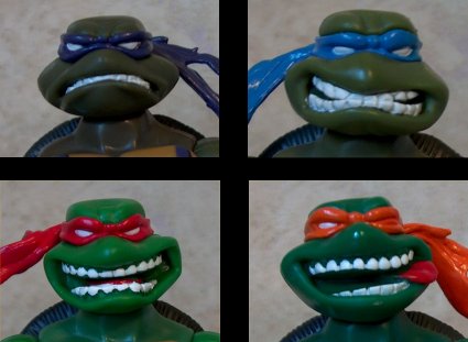 Love, Brodie |
|
|
|
|
|
11-05-2007, 12:42 PM
|
#279 | |
|
Foot Elite
Join Date: Dec 2003
Posts: 4,439
|
Quote:
Let's just wait till the show airs and pick on the substance, not the initial designs. I'm not a fan of them either, but we don't have much to break dwon with one lousy picture.
__________________
[Insert mildly amusing banner here] |
|
|
|
|
|
11-05-2007, 01:32 PM
|
#280 | |
|
Mad Scientist
Join Date: Sep 2005
Location: SoCal
Posts: 1,115
|
So much love. Geeze...
I thought Michael Dooney's artwork for 2k3 TMNT was actually quite decent. For the most part, the show stuck well to the character models. I don't deny that there were several episodes where the animators failed to faithfully adhere to the designs. I cite one of my favorite episodes, Return to New York pt. 3. If you can recall, after the big fight the TMNT suddenly look like cabbage patch kids. Then, season four sees a sudden drop in part two starting with the episode "Ancient One." Everything starts becoming more angular. (The Lost Season returned somewhat to better design, though the coloring was tasteless). And don't get me started on the FF design. While I think the scripts, stories, storyboarding, visual pacing and whatnot certainly improved to the point of being enjoyable later into the season, it doesn't cover up the fact that the design (but moreso the unnatural coloring) sucked hairy camel balls. Quote:
 So, yes -- there have been moments when the TMNT 2k3 design didn't look so great, but I don't think anyone's advocating the FF design or those stupid action figures you brought up. Though I have to agree about the overbuilt superhero look. Probably the one thing that bothered me about the 2k3 design. Really takes the "teenage" out of the title.  Still, if I had to choose between the Superbuilt Mutant Ninja Turtles and the Teenage Mutant Squishy Turtles look, I would go with the former. But that's just me.
__________________
We're calling it a freeway. Eight lanes of shimmering cement running from here to Pasadena. Smooth, safe, fast. Traffic jams will be a thing of the past. I see a place where people get on and off the freeway. On and off, off and on all day, all night! Soon there will be a string of gas stations, inexpensive motels, restaurants that serve rapidly prepared food! Tire salons, automobile dealerships and wonderful, wonderful billboards reaching as far as the eye can see! My God... It'll be beautiful.
|
|
|
|
|
 |
|
|



 Linear Mode

